From Creative Bloq – http://bit.ly/1wdOj5e
We review the most impactful logo designs and redesigns of the last 12 months.
On the day a new logo design is launched for a familiar brand, the first reactions are usually overwhelmingly negative. Once some time has passed and the new design has entered daily use, though, it can be a different story.
So here we take a look back at the 20 biggest brands to release a new logo in 2014. Now you’ve got used to them, what do you really think of them? Let us know in the comments below!
01. Black + Decker
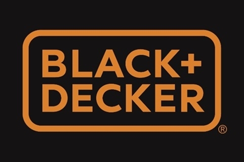
Black + Decker (formerly Black & Decker) gave its ageing logo and branding (below) a new lease of life in January with a fresh modern look (above).
New York-based design agency Lippincott took the reigns for the redesign, ditched the hexagonal nut, swapped out the ampersand for a plus sign, and simplified the whole thing by making the typeface and colour border the same width.
02. Visa
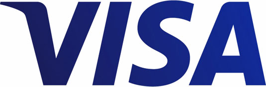
This subtle logo redesign from Visa (above) took place in January, with the company changing their usual tag line ‘for everyone, everywhere’ and evolving it to ‘It’s everywhere you want to be.’
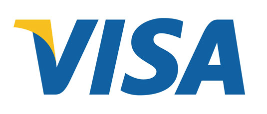
The first external expression of the new platform debuted with a new Olympic-themed television commercial airing in the United States, and then expanding to reach key audiences through variety of other traditional and digital channels in the coming months.
03. Absolut Vodka
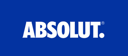
The Absolut Vodka logo didn’t changed massively in 2014, but it did change. Leaving the ‘Country of Sweden’ and ‘Vodka’ aspects of the old logo (below) behind, the new logo (above) now simply reads ‘Absolut’ followed by a full stop.
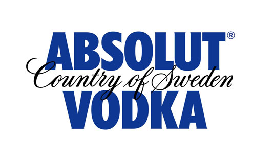
Global director of design strategy at Absolut, Anna Kamjou, said: “The brand has become so iconic that we no longer needed the full three-line logo to convey ourselves.”
04. Lipton
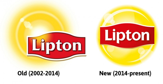
March saw tea brand Lipton unveil a new logo design in a Muppets promo commercial, which saw the brand take on a cleaner, more crisp look.
Whilst the new typography enabled readability, some claimed the new design looks too much like the Lays logo.
05. Birds Eye
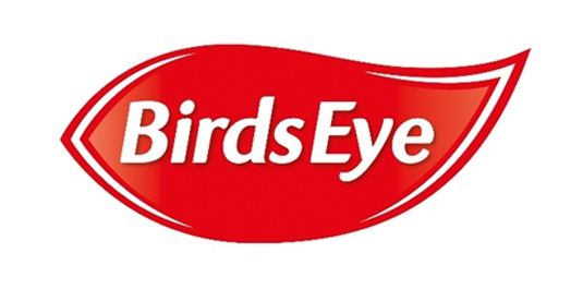
In March, Birds Eye spent £60 million in a Europe-wide brand relaunch that saw a new simplified logo (above).
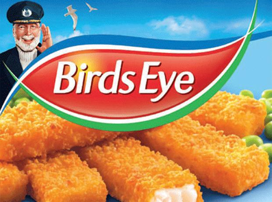
Launched by Havas Worldwide and designed by JKR, the new design saw the Captain illustration (see above) disappear entirely and the pre-2007 red marque reintroduced.
06. Reebok
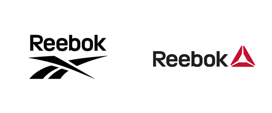
After nearly 30 years of the same logo design, sports giant Reebok rolled out these brand new logo designs in March. Created by branding agency Les Mills, the new design aimed to ‘encourage ordinary people to do sport.’
Reebok’s Chief Marketing Officer Matt O’Toole stated: “It’s an invitation for all of us to take part and fight against complacency for everyday people not just super stars and elite athletes.”
07. Netflix
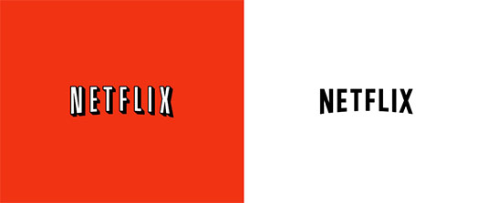
Debuting on a trailer for Orange is the New Black, April’s redesign for Netflix was subtly simpler. Taking away the shadow aspect on the font allowed the logo design to convey a more modern, minimal feel.
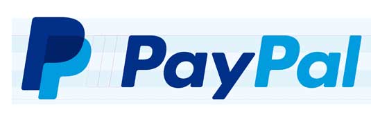
08. PayPal
In April, online payments service PayPal has unveiled a new logo and brand identity, which was created in collaboration with San Francisco design agency Fuseproject. It was very much an evolution, not a revolution from its previous designs, which are shown below:
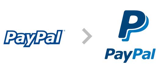
The refreshed branding featured four key elements:
- a new wordmark in a new typeface (Futura)
- a new version of the double-P monogram
- a refreshed colour palette
- a new ‘dynamic angle graphic’
While the wordmark and the monogram locked up together for PayPal’s new signature.
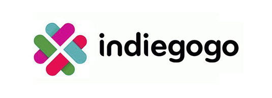
09. Indiegogo
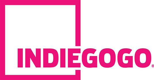
As the first and original crowdfunding website, Indiegogo is still a relatively young company, having only launched back in 2008.
Released in April, this new logo (above) represented “the company’s mission to work hand-in-hand with campaigners to democratize finance and give people around the world the power to fund what matters to them,” they explained.
10. Disney Channel
In May the Disney Channel rolled out a new logo design (above) across all its international TV networks – and it was a radical change from the previous identity.
At first glance it looked like a purely typographic logo, in which the Mickey Mouse silhouette that dominated the old logo (above) remained only as a subtle squiggle.
11. Google
Kerning. It can be the difference between your type being aesthetically pleasing and jarringly horrid, and getting it right is one of the 10 commandments of typography.
Never one to rest on laurels, in May the Google branding team adjusted the famous logo – which had received a redesign only eight months previously – to improve the kerning. Subtle stuff, but nothing gets past us at Creative Bloq…
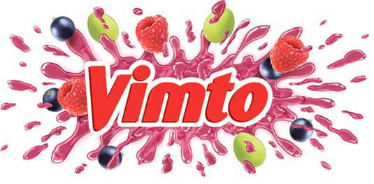
12. Vimto
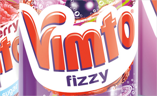
Released in May, the new logo from soft drink brand Vimto was designed to drive trial and frequency of purchase.
Created in conjunction with Springetts Brand Design and inspired by the brand’s ‘Seriously Mixed Up Fun’ tag line, the logo was designed to ‘burst’ from the packaging, although less explosively that the previous logo (below).
13. Intel
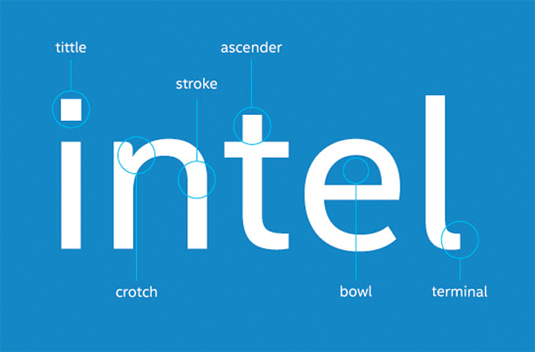
With more and more of you visiting sites via your mobile devices, Intel were very clever with this very subtle logo redesign. The tech giant has created its own proprietary font, Intel Clear, designed to be easier to read on screens and which can be used across different alphabets. The new font was developed by Red Peak and font house Dalton Maag.
14. Airbnb
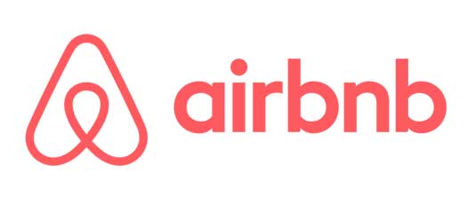
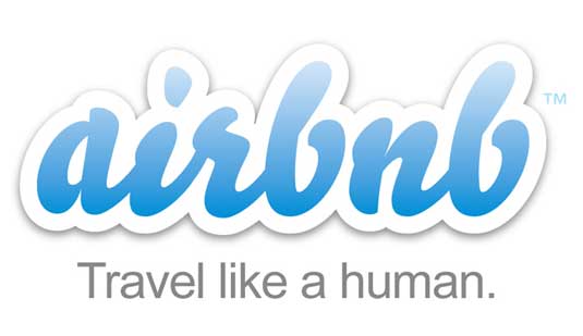
Airbnb is a popular web service enabling you to rent rooms in your home out on a per-night basis for those looking for an alternative to hotels. In July it unveiled a new website design and logo, which raised eyebrows for four reasons.
Firstly, it gave the new logo symbol a name – Bélo – and explained that it was “the universal symbol of belonging“, which seemed like a slight case of PR overreach. Secondly, it allowed users of Airbnb to make their own version of the logo.
Thirdly, it attracted complaints that it was too similar to another company’s logo. And finally (and there’s no polite way of putting this) it provoked considerable social media chatter over whether it looked most like male or female genitalia.
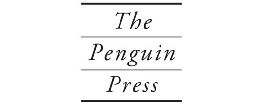
15. Penguin Press
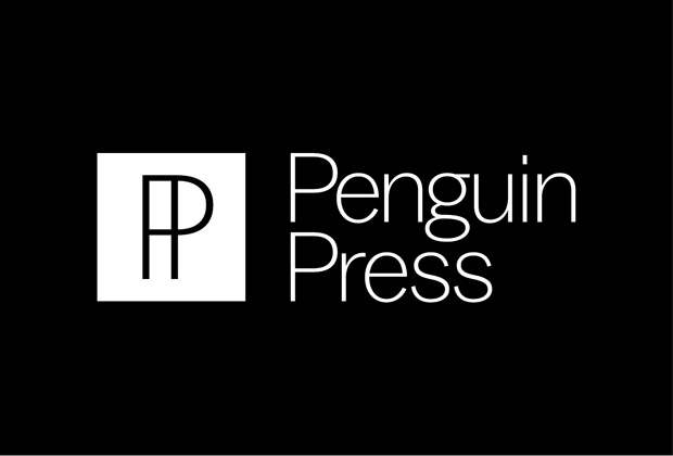
Penguin Press is a mainly non-fiction imprint of Penguin Random House books, that’s been around for 11 years now. In July the company decided to give it a new look, and worked with Michael Bierut at Pentagram to create a new identity (above) that establishes an iconic symbol for the imprint.
The previous wordmark (below) had been almost illegible when reproduced at smaller sizes and particularly suffered onscreen, a liability in the age of social media
The designers decided to drop ‘The’ and focused on working with the ‘PP’ acronym. Noticing the similarity to ¶, the proofreader’s symbol for a paragraph (known as a pilcrow) they came up with an evocative symbol that looks at once modern and classic.
16. Foursquare
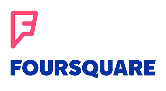
Location-based social networking app Foursquare unveiled a brand new logo and branding in July, alongside an entirely new app platform.
The company removed its check-in system – once the app’s USP – to become a slimmed-down local guidebook personalised to your tastes, akin to Yelp or Google Maps, and the new look (above) was designed to reflect that.
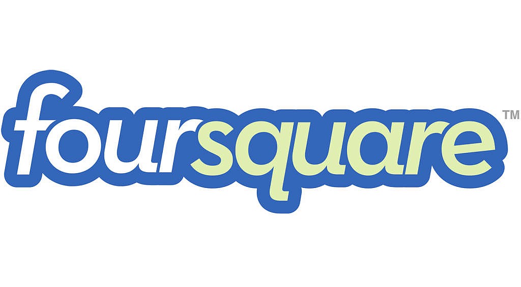
The new logo design was a far cry from its bouncier predecessor (above). Designed in collaboration with New York agency Red Antler, the all-caps wordmark presented a cleaner and more professional face to the world.
The new logo design aims lend a graphic unity to way-finding signs, building entrances, digital directories, kiosks, uniforms, websites, apps and marketing materials.
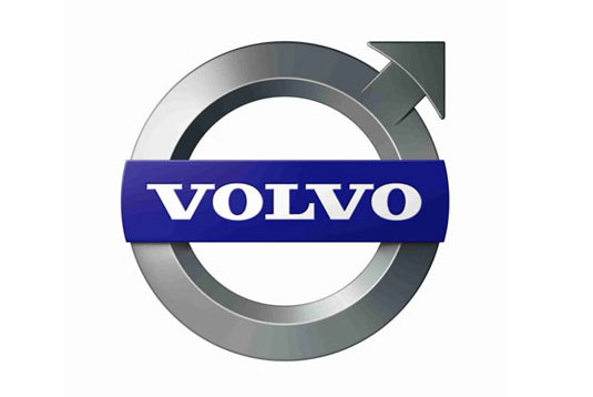
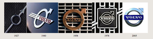
17. Volvo
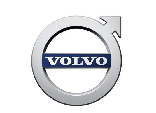
September saw the silver and black versions of the new Volvo logo, created for the car company by Swedish design agency Stockholm Design Lab in collaboration with Tröllback & Company.
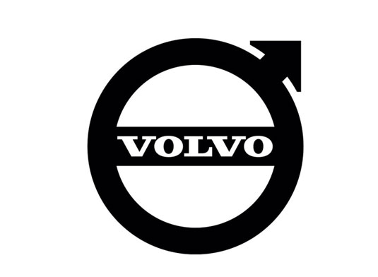
The new design was a subtle but important tweak of the defiantly masculine logo created by Bite in 2006 (see below), and continues to evolve the iconic ‘Ironmark’ symbol first created in 1927.
18. Hershey
In September, The Hershey Company, known for its Hershey’s Milk Chocolate bars and more than 80 other confectionery brands, including Reese’s and KitKat, unveiled a refreshed corporate visual identity, including the new logo shown above.
A move towards flat design and away from the 3D styling of the old logo (below), the new logo aims to reflect the company’s evolution from a predominately US chocolate maker to a global confection and snack company.
The new branding was created in-house by Hershey Global Design, with assistance from goDutch and Alexander Design Associates. It will be incorporated into all of Hershey’s consumer communications and websites, as well as the interior design of its offices and retail stores.
Most notably, the new design featured a new interpretation of the iconic shape of its Kisses brand chocolate. But it attracted the wrong kind of attention on social media, for its perceived resemblance to something dogs leave on the street…
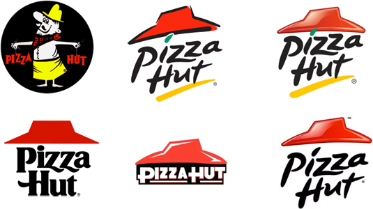
19. Pizza Hut
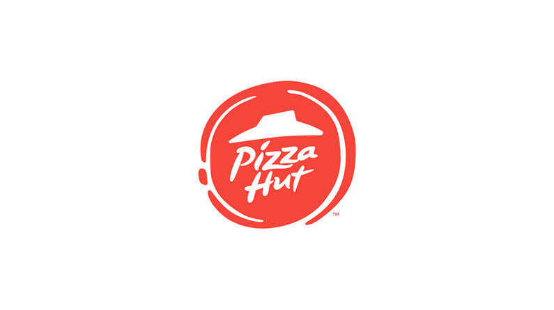
In November, one of the biggest restaurants in the world announced a major change in its menus and overall look of its restaurants , including a change in their branding and logo designs.
Stripping back the design, the new logo (above) is a big step away from the old design (below) – portraying a pizza-like circle with a more muted red whilst still keeping the iconic ‘hut’ illustration.
20. DeviantArt
DeviantArt, the online art gallery that boasts 32 million registered members, revealed a radical new rebrand in December.
The new look, created by Moving Brands, led with a new logo – a slice of the well known DA initials – in a bespoke ‘Calibre’ font, created by Klim Type Foundry.
However, reactions to the new logo were mixed, with the new branding dramatically dividing the community.
What do you think of the logos unveiled in 2014? Leave a comment in the box below!