
By Tammy Guy, from UX Magazine – http://bit.ly/1g5VZmy
In general—but particularly in the design world—color is a powerful tool. It conveys moods and emotions, adds presence to designs, and builds brand identities. All too often, however, users who suffer from any color deficiencies struggle to navigate their way through our color-drenched world. For their sake, I often advise designers to have accessibility in mind and test web pages in gray scale format to ensure usability remains in tact when colors aren’t viewed in the intended way.
Users who suffer from any color deficiencies will have difficulties to distinguish the differences between certain colors. The most common type of color deficiency is red-green color-blindness, where red and green are seen as the same color.
Below is an illustration of the most common forms of color-blindness taken from Color Matters.
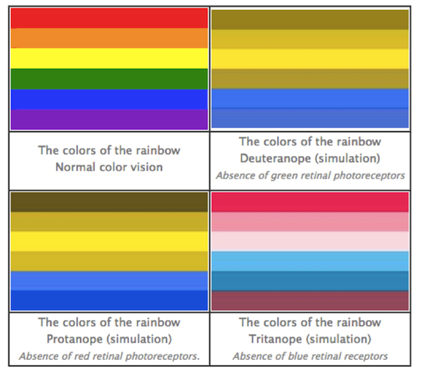
Looking at this chart, one must consider the visibility (or lack of it) of red error messages to users with this type of color-blindness when completing online forms.
Let’s take a look at the home page reservation form Avis gives us. I simply clicked “Continue” without filling anything out, and the error message I received to “Please enter a Pick-up Location” was presented in plain red text.

Now, let’s look at the same layout through the eyes of a red-blind user using Colblindor, a color-blindness simulator.
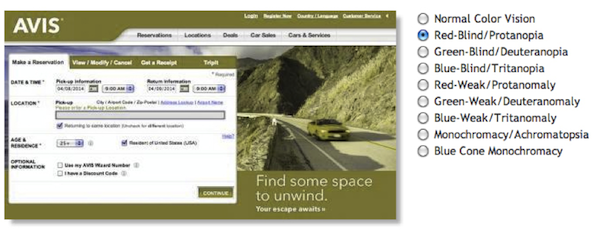
The high contrast of the red error message has been lost and instead, replaced with green color text that nearly blends in with the black content on the page and is very easy to overlook.
Another example comes from the Budget home page reservation form, where again I simply clicked “Continue as guest” to receive an error message. In this case, the red error message is presented with red copy over the field’s label and a red border around the actual field.
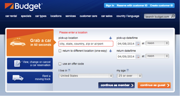
Lets view this through the eyes of a green-blind user using our color-blindness simulator.
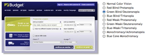
Red colors are lost and replaced with light green colors. The green copy does not carry enough contrast to attract any attention and the field’s border no longer appears highlighted at all.
Conclusion
Don’t rely on color alone to deliver your messages online. Instead, combine color with other design fundamentals such as typography, shapes, grids, and spaces and allocate more weight to important elements.
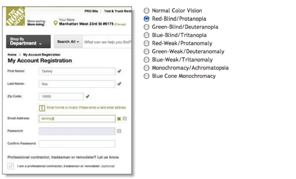
The Home Depot account registration form is utilizing shapes in addition to color to indicate where problems arise. An exclamation point presented in a square shaped box precedes the error message copy in addition to an “x” near the relevant field to indicate an error has taken place.

Colblindor’s simulator will again display how all red and green hues are removed, but instead, users may relay on shapes as an indication to actions done right or wrong.
Test out your pages with Colblindor or simply change your settings to gray scale to ensure usability does not break when colors go away. Send us before and after shots if you found you had to fix some elements for accessibility on Twitter, Facebook, or Google+ using the hashtag #colorbind (that’s colorb-i-n-d; no “l”). We’ll add our favorite submissions to this article. (Image of “red” traffic light courtesy Shutterstock)


