By David Marland, from Smashing Magazine – http://bit.ly/ShrySq
The BBC’s Programmes website is huge, and is intended to be a rolling archive of everything that the BBC broadcasts on television and radio. Originally released in 2007, it now has pages for over 1.6 million episodes, but that’s barely half of the story. Surrounding those episodes is a wealth of content, including clips, galleries, episode guides, character profiles and much more, plus Programme’s newly responsive home pages.
The new responsive home pages, known as “brand” pages, join the schedule and A–Z lists in a broader responsive rebuild. 39% of users (and growing) now use mobile and tablet devices to visit these pages; so, making the pages responsive was the best way to serve a great experience to everybody while keeping the website maintainable.
This article is a case study of the responsive rebuild of the BBC’s Programmes pages, and it actually begins back in 2007, at the conception of the project.
URLs
The core principle in creating a potentially enormous website that will last forever is to get the information architecture right in the first place. This involves knowing your data objects and how they fit together. It should also determine the URL structure, which for Programmes is the most important aspect. Take the URL for Top Gear’s home page:
http://www.bbc.co.uk/programmes/b006mj59
After the domain name comes the word “programmes,” which is a simple, unchanging English word. It is intended to describe the object, and is not a brand or product name. Plurals are used so that the URL can be hacked backwards to retrieve an index.
Next is the programme identifier. Note the lack of hierarchy and the lack of a title. Titles change over time, and many programmes do not have a unique title, which would cause a clash. Hierarchies also change — a one-off pilot could be commissioned for a full series. Understanding your objects allows you to recognize what is permanent. In this case, nothing is particularly guaranteed to be permanent, so a simple ID is used instead. Users aren’t expected to type these URLs, though. They will usually arrive through a search engine or by typing in a friendly redirect that has been read out on air, such as bbc.co.uk/topgear. But the key principle of a permanent URL is that inward links are trusted to be shareable and work forever. Cool URIs don’t change.
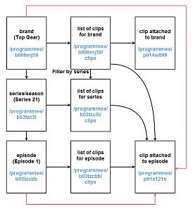
A clear information architecture defines the URL scheme. A piece of content is given a clear canonical home, where appropriate. Links and aggregations between them then clearly appear.

A clear information architecture defines the URL scheme. (Click to enlarge)
It is clear how the data will be sliced before any wireframes are drawn or code is written. The black lines are direct links, while the red lines are shortcuts that we’ll add later.
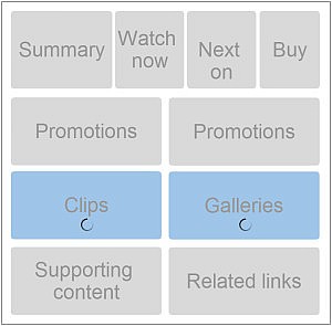
On the brand page, we display the following information about the programme:
- Summary (image and synopsis)
- Can the user watch or listen to it now?
- When will it be on TV or the radio?
- How does one buy it?
- Clips from the programme
- Galleries from the programme
- Editorially curated links to content (promotions)
- Textual supporting content
- Related links
This is a lot of content for a responsive page. Page loading could become excessive on low-end devices, so a priority needs to be determined.

Loading priority should be determined for sites with large amounts of content. (Click to enlarge)
Content is king, so hiding it on smaller screens is not acceptable. If any content could be sacrificed on mobile, then question whether it truly belongs on the desktop to begin with. The user journey remains the same, regardless of the device being used.
However, even though content may not be sacrificed on mobile, it doesn’t have to be present in its full form all the time. A simple link to the content might suffice, and because we have already defined a URL structure, most of the content already has somewhere to link to. Therefore, the block of “clips” on the brand page will, by default, link to this:
/programmes/:id/clips
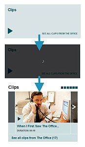
This is Web-friendly and the minimum viable product. If no more work was done, we’d still have something that works. The next phase is to see whether any enhancement can be made. We can use JavaScript to determine screen size (and possibly other factors) and then decide whether to load some shortcuts. By default, just a link is shown, but with enough space and if JavaScript is available, the link would be replaced with a carousel of the first six clips. These first six are the same six from /clips; this lazy-loaded content is simply a shortcut (the red lines from earlier).

Different states of lazy loading content. (Click to enlarge)
JavaScript can be used to lazy-load content fairly often, but we have rules:
- It may not be used for core content or for the user journey of the page.
- It may be used only where a URL exists for the content, never for
href="#".
The top area of the page (which shows what the object is and how to watch it) is the core user journey of the brand page, so it is not lazy-loaded. Clips, galleries and recommendations are lazy-loaded, but promotions are not because they do not have URLs of their own. You could argue that promotions could be surfaced at the following URL:
/programmes/:pid/promotions
But promos are not really “consumable content.” A user wouldn’t click a link to see all promos in this context, so promos are not lazy-loaded.
Images
Images are always a challenge in responsive Web design, and they were for us, too. Some of our long aggregation pages contain a lot of images, which need to be displayed at sizes appropriate to the device. The total download size of these long pages can be over 1 MB, mostly due to the images.
Therefore, we decided to tackle images in the same way that we tackle content, by asking whether a given page is the canonical home of the image. If it is, then the image must be there. If it isn’t, such as on the aggregation pages, then the image isn’t there by default. We then load in the most appropriate-sized image for the container with JavaScript. Additionally, only images currently in the viewport are loaded. As the page is scrolled, images that are about to appear are pulled in. This technique saves a lot of bandwidth on initial page loading, vastly improving response times for users, especially on small devices and when the user doesn’t scroll far. A useful library that uses a similar technique is used on BBC’s responsive News pages and is available in the open-source Imager.js.
At first, the implementation of this technique made the page jump around a lot as the user scrolled down and the images appeared. To work around this when the page first loads and the JavaScript kicks in, we load an old-fashioned spacer PNG, which has a 16:9 ratio and occupies the spaces of the images that will be filled in later. This is one extra download request for a small file that is used throughout the page. Using an inline base64-encoded PNG might have been preferable, but we discovered that Windows Phone devices do not display the holding image in the correct ratio, rendering it as a 1:1 square, so we had to use a standard PNG.
The techniques so far suggest a lot of use of JavaScript. This is true because it is loaded and runs on every page, but it is used with a light touch. JavaScript is not a requirement for any page (except for the playback of media), and it doesn’t do any particularly heavy lifting. Lazy-loaded content calls a .inc partial URL, which returns HTML that is simply dropped into the page. The JavaScript barely does any DOM construction because the elements are constructed by server-side code, reusing the same partials.
Templating frameworks such as Handlebars could construct the DOM elements from a JSON source, but why fight the pre-parser? Browsers are extremely efficient at parsing and rendering HTML quickly, so we wouldn’t add complexity for such a simple use case. The website works and is stable without JavaScript — no need to overdo it.
CSS
Building a large website that is maintainable requires a CSS strategy, or else it would balloon out of proportion. We decided to follow the BEM methodology to create reusable blocks of CSS. The blocks might be granular and generic (for typography and grids) or more modular (for whole objects). The CSS is built up from Programmes’ style guide

An example of BBC’s programm styleguide.
This is the Programmes object. It is a server-side-generated partial and is used in multiple locations around the website. It has several variations, depending on the container that it needs to go in or the content that is available at a given time. The options are demonstrated on the corresponding page of the style guide, where they can be built and tested, ready to be dropped (hopefully) flawlessly anywhere in the application.
This method of building reusable CSS gives rise to some extra markup in the page, with some particularly long examples:
<div class="grid bpw2-thirteen-twentyfourths bpe-thirteen-twentyfourths grid--bounded">
However, because these are generated by server-side code, they are usually easily updatable. These blocks tend to be repeated throughout the page, but Gzip compresses the markup extremely well. This CSS framework makes for a very reusable system. Programmes’ global.css file is included on every page and handles everything related to layout, all at just 15.4 KB (after Gzip’ing), which speeds up the creation of new pages. We can throw together some simple list-based pages, such as recommendations, within minutes, without having to write any new CSS and by reusing the same Programmes object partial. This also enforces consistency across pages.
All objects are built to be touch-first, but not touch-dependent. The stream, which can be seen on the season page, has an overflowing div in order to support native scrolling and automatic touch capabilities. However the arrow buttons (note not <a> tags) are still present for old devices and for people who wish to use a keyboard and mouse. The detection of touch does not necessarily mean that the user is touching to navigate, so mouse hovering is always supported.
Touch-first also means large hit areas. The Programmes object above has an overlaid link to make the whole object clickable, even though it will sometimes have multiple links within it.
After we launched this feature, we were informed by a user that in Windows high-contrast mode, all Programmes objects disappeared. We discovered that in high-contrast mode, Internet Explorer 9 forces the background of all links to be solid black, effectively obscuring the object. To overcome this across the board, we had to force the background color to be transparent with RGBa, and we set the opacity of the overlaid link to 0, which allowed the object underneath to show through.
.block-link__overlay-link {
   top: 0;
   right: 0;
   bottom: 0;
   left: 0;
   overflow: hidden;
   text-indent: 200%;
   white-space: nowrap;
   background: rgba(0, 0, 0, 0); // IE 9 fix
}

// Increased specificity so that it trumps ".block-link a"
a.block-link__overlay-link {
   position: absolute;
   z-index: 0;
   // The next line is needed because all elements have a solid-black
   // background in high-contrast mode
   opacity: 0;
}
At present, the BBC still receives a lot of traffic from Internet Explorer 8, which does not support media queries. We had to decide, then, what to show these users. The first option would be just to show the mobile version of the website to them, suitably scaled up but with nothing complex happening. This was not acceptable as the usage numbers are still too high, especially among the editorial staff. Therefore, we came up with a workaround.
We build our CSS using Sass, which fits very well with the modular structure, allowing partials to be organized in a clear folder structure. Wherever we use media queries, we can abstract them into breakpoints using Sass and then name them. In our main file, we then decide which breakpoints to pull in and whether to wrap them in media queries. The Sass component for handling this is available as Breakup. This means we can have two files: global.css and global-ie.css. The global-ie.css file gets all of the base and desktop breakpoints, without media queries, meaning that it is a fixed 1008-pixel page. We then decide which CSS to serve using IE conditional comments:
<!--[if (gt IE 8)|!(IE)]><!-->
        <link rel="stylesheet" href=”path/to/styles/global.css" /><!-- Also contains print -->
    <!--<![endif]-->
    <!--[if (lt IE 9)&(!IEMobile)]>
        <link rel="stylesheet" href="path/to/styles/global-ie.css" />
        <link rel="stylesheet" href="path/to/styles/print.css" media="print" />
    <![endif]-->
It also extends to the print CSS, because we can wrap that in media queries for newer browsers, too, which saves an extra download.
Limitations
Our responsive design still has a few limitations in its capabilities. We are keen to see a native solution for element queries to fix a few minor icon-sizing issues without the need for polyfills. At the moment, we can only make decisions based on the whole window size.
![]()
Roughly same-sized images should ideally get the same-sized icons.
There are also a few situations in which the markup order isn’t ideal on all devices. Improvements such as CSS grid layout will enable us to interlace modules at different screen sizes.
Conclusion
By building a website on which the content is king, starting with a clear information architecture and well-defined URLs, we have built a framework that we are proud to maintain. Using a sound URL scheme and building pages with semantic markup give us many benefits for free (or at least partially for free):
- permanence,
- stability,
- optimization for search engines (linkability),
- accessibility,
- shareability.
By progressively enhancing, we could still build an interface that is attractive and information-dense where appropriate. We will continue to adapt with new responsive features as they become available and once visits from old browsers decline enough that we can move ahead. Reusable content components and CSS make that easier to do, thus making it possible to look after such a large website as it continues to grow every day.
