

Do you know the proverb: “Plenty is no plague”? How is it connected to today’s topic? The author begs your pardon for her passion for proverbs, idioms and metaphors, but some of them contain the quintessence of human intelligence and, as you know, “wit beyond measure is man’s greatest treasure”.
To put these bombastic sentences in simple words, we would like to say that it’s incontrovertible that a good website design can become crucial for your business. But different people may understand absolutely opposite things under the word “good”. And now is the best time to switch on the common sense, professional designer’s skills and brains to the fullest.
The age of personal business meetings has gone. People don’t want to bother themselves, especially when it comes to the first appointment. It’s much more convenient and swift to find a company website on the net and read all the essential information there. It’s like an entrance examination – your company will either pass or flunk it.
So Here Comes Our First Conclusion
To make a first positive impression on the user, your website should be aesthetically appealing and extremely user-friendly. However, our ideas of aesthetics in web design cardinally differ as a rule. Corporate style definitely has its own, individual features that make it stand out from the rest. Many business owners consider that a business website should look accordingly – strict and solid. And their convictions definitely make sense.
In our article we will try to work out some main guiding principles designers can stick to in order not to overdo their experiments with corporate style and turn their creations into sterile, faceless dummies dressed in offish suits but empty inside.
Undoubtedly, there are some standards, universal rules apply to corporate web design, however this does not mean that business companies should ignore new, fresh web design trends. If your website looks outdated who will bet that your products or services are not moss-covered as well.
We reckon that now is the right time to enumerate major web design trends for 2014 according to Forbes. There are very few of them, so it will be easy to memorize the info.
- Simplicity
- Storytelling
- Responsive design
We don’t think that they need any additional explanation, as there are thousands of articles on the internet chewing over each and every detail.
Now let’s delve into the matter
Supposing your website perfectly tells the story of your company, has intuitive navigation, concise text, is compatible with all popular browsers (including Firefox, internet Explorer, Safari, Opera and Chrome) and is accessible from a large variety of mobile devices (smartphones, tablets, laptops, etc). What else can have crucial significance for your positive corporate image? What about colors? It’s a well-known fact that different hues make a different impact on the user. Of course, most of businessmen want to apply their corporate colors, associated with their brand. And every brand wants to convey the feel of the company, its purpose, level of expertise and make solid, trusted and lasting impressions on the public. Here graphics, colors and layout really matter as visitors’ perception depends on them.
According to color theory, designs using a dark palette, may be interpreted as serious and luxurious, while blue hues give a feeling of trust. That’s why omnifarious hues of black and blue colors can be seen in business site designs so frequently.
The next utterly essential thing is to know your target market as this factor also imposes its imprint on website design. For instance, if your target audience is mature, perhaps, it makes sense to use larger fonts. If you want to draw youngsters’ attention, your website should be perfectly rendered on smartphones.
Besides, it’s good for your business when the visitors understand where to go next as soon as they enter your website, otherwise they abandon it and you lose money.
This point is not less important than the others. The information on your site should be up-to-date. If you don’t update the content on your blog once a week or even more often, visitors might think that your products or services are not innovative and competitive enough. Fresh info makes not only users but also search engines happy. And, by the way, don’t give links to your Facebook, Twitter or other social media accounts if your company doesn’t have enough followers, as people may think that your business is too small and they are not interested in partnership with you.
Most business companies try to impress their visitors with solid site structures, thought out navigation and credibility of the presented content. Due to that, business layouts are mostly informative and not too attractive. However, visual appeal is an inevitable component of perfect corporate design.
What else makes business design perfect?
- Clean everything – code, text and graphics.
- Harmonious, balanced layout – all site elements are hierarchically arranged and consistently placed on all pages.
- Each and every small detail like link colors and headings are well thought-out and blend with the rest of the layout.
- Enough white space, which helps to emphasize design and content.
- Usage of modern design elements, staying in the frames of moderate, reserved design without extreme graphic experiments.
- Intuitive color schemes and high contrasts make the legibility of text and the perception of visual elements optimal.
- Business sites don’t need to be gorgeous. Their descriptive manner really works and matters.
- Choose minimal designs. The secret of their success is in the fact that you don’t give the visitor a single chance to focus on anything else, but your product.
Continuing the theme of minimalism, we recommend you take into account only what is basic in website design. We mean, create a straightforward homepage, so that the user sees the most important information at once. Actually, ‘Home’, ‘About us’ and ‘Contact’ pages are absolutely necessary and require your special attention. Too many subpages with too much content scattered over them make things more complicated, which is bad both for merchants and for prospective clients.
Please, don’t misunderstand our ode to minimalism as a direct call for colorless design. On the contrary, the first sensory stimulus between the consumer and the brand is color (here we have quoted Leslie Harrison of the Color Association). You can’t but agree that the visitors see the color before they can process the words on the page. Moreover, colors stay longer than words in their memory. The question is what color is best for your particular business? For example, if you sell electronics, choose a white background in order not to distract the customers from your products. When you want to promote something expensive and elegant, use black. If you offer global tours, bright, cheerful colors will make your design complete.
Don’t forget about call-to-action buttons. The moment the user clicks the button can become crucial in taking the decision whether to become your customer or not. That’s why site owners and web designers should create the best and the most efficient buttons for the particular site. Many marketing specialists recommend orange for call-to-action buttons as this color stimulates users’ activity.
Minimal scrolling is ideal for the home page. As a rule, visitors are short of time and can’t scroll for hours to read all your content. Links leading to separate pages with vital information can be a good way out of this situation.
One of the contemporary ways of drawing traffic to your website is to provide useful and informative content on your company blog. Ideally, an article (containing keywords for search engines) with tips, answers to urgent industry questions and other related info should be posted there.
And don’t forget about logo design. Actually, it is the soul of your band. We advise you to put maximum effort into your logo design as it is not simply a set of shapes, but your brand identity that will be recognized or not recognized (depending on the result) by your customers.
A good business website lets users customize the products you’re selling. For example, if you’re selling shoes, it’s necessary to have some options like size and color. This way you are more likely to please the customer and get your order.
Product reviews and feedback are also important. Most buyers prefer purchasing goods with positive reviews and high ratings. Besides, handling customer’s opinions, comments and critics on your products or services, you can gradually perfect them, which will result in more satisfied buyers in future.
Announcing upcoming events and alerting people about special deals and discounts via email as well as sharing new images, videos and latest news help to keep your clients interested in your services. If customers know that you update your website regularly, they visit it more willingly.
A message board is one more way to communicate with your visitors, which is great for building a circle of loyal customers.
And the last point in our list is 24/7 customer support. Lots of users don’t want to search your FAQ page for the answer or just feel more confident when they can chat with a friendly support manager who can solve all their problems quickly and professionally.
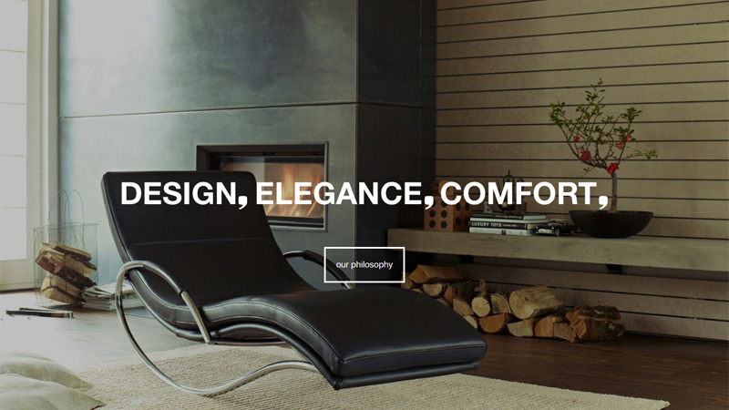
Examples of Modern Business Websites
Below you will see the best, modern examples of business websites you can use for inspiration if you have no original ideas. However, we are sure that after such a strong dose of inspiration, you will have plenty of fresh concepts that will take your business to the topnotch level no matter what you are doing: selling million dollar houses of a few cents balloons.
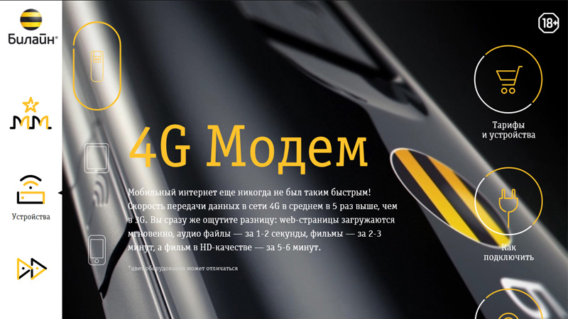
Beeline
This website is modern, accurate, businesslike, but not tedious, which is its great advantage.
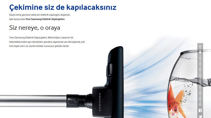
Samsung
Who told you that humorous elements are out of place on business websites? This one proves just the opposite…
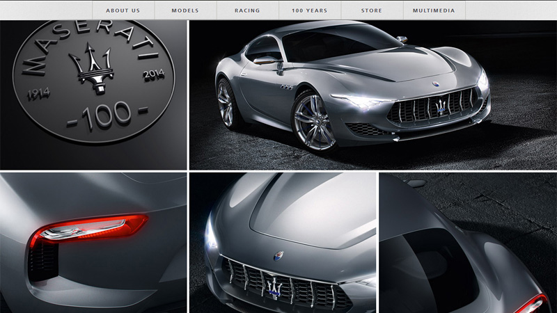
Maserati
Gorgeous girls and luxury, expensive cars are always so attractive…
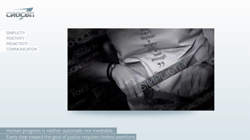
Crocon
A video in the center of the content area and a slider at the bottom of the page make this website very dynamic.
Genau
Just try their fly-out image-based menu; it’s amazing like the rest of the website.
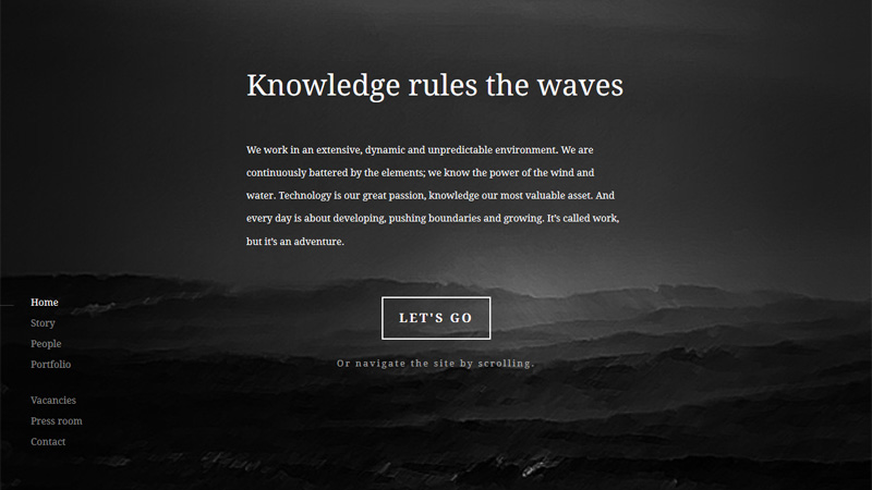
The Offshore Partners
Try to scroll down, you’ll find the most unexpected things there.
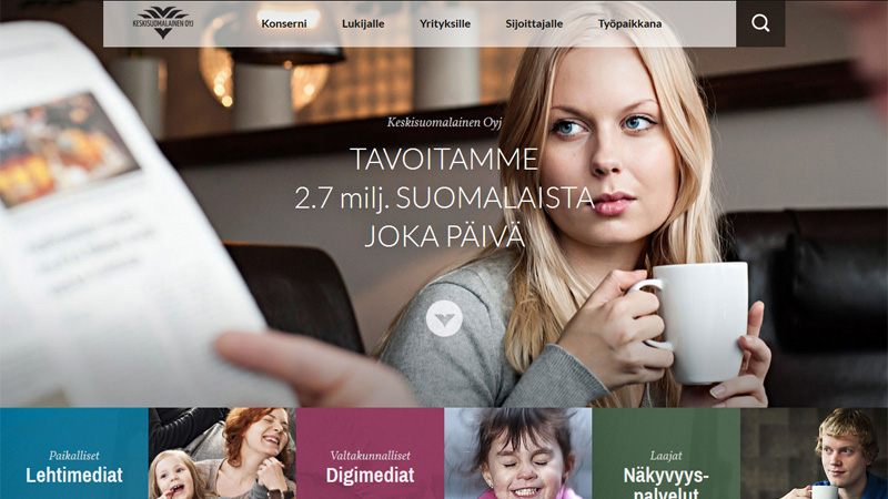
Keskisuomalainen Oyj
Rather colorful solution for a business website. We can even see the mixture of grunge and ultra-modern elements, but the guys still stay in the frames of corporate design.
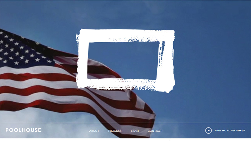
Pool House
This painted frame and background video make the website really unique and interesting to view.
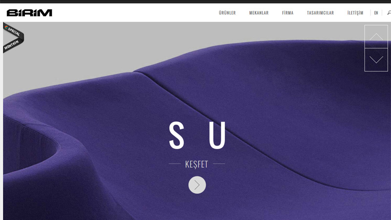
Birim
This is the result when a picture is worth a thousand words.
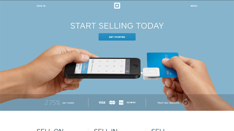
Square
Feel all the magic of pastel colors on this minimalistic, ultra-modern website.
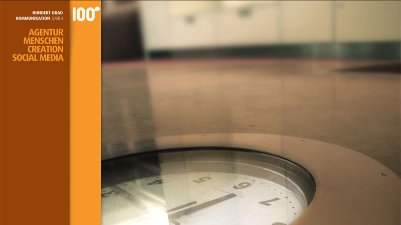
Hundert Grad Kommunikation GMBH
Their vertical navigation bar is rather unusual and this hand looking right into your eyes next to the social media sharing block is simply inimitable.
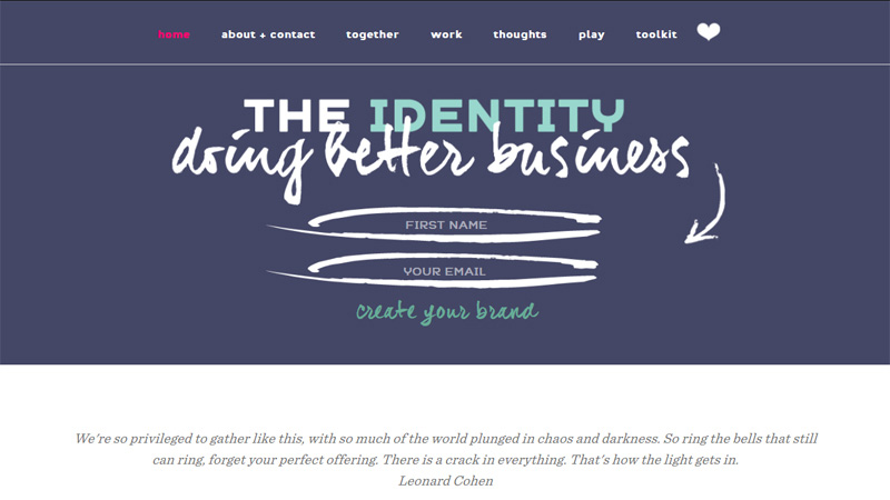
The Identity
Handwritten fonts, arrows and underscores make website environments informal and welcoming, simultaneously emphasizing important content.
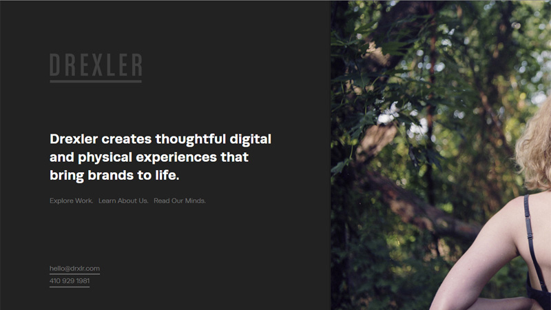
Drexler
Look how the black block matches the photo, this uncommon combination encourages further website exploration.
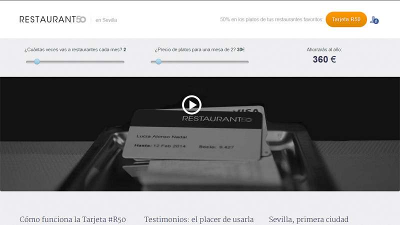
Restaurant 50
It’s a good move to combine different design styles, like here, retro elements add some warmth and personal touches to the website.
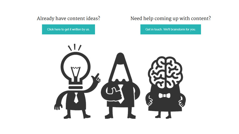
Content Row
How do you like this comic company of bulb, pencil and brain? Sometimes a humorous approach can make your corporate website really special.
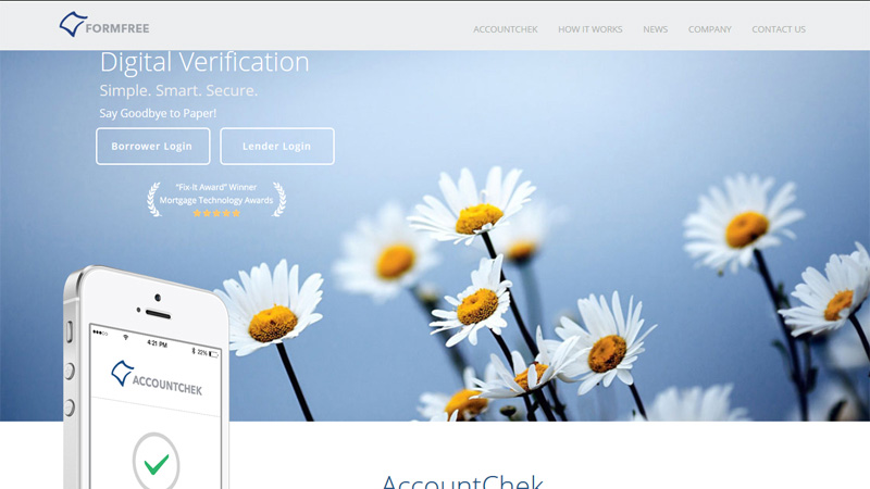
Form Free
Live flowers and digital appliances? Hmm… Looks nice.
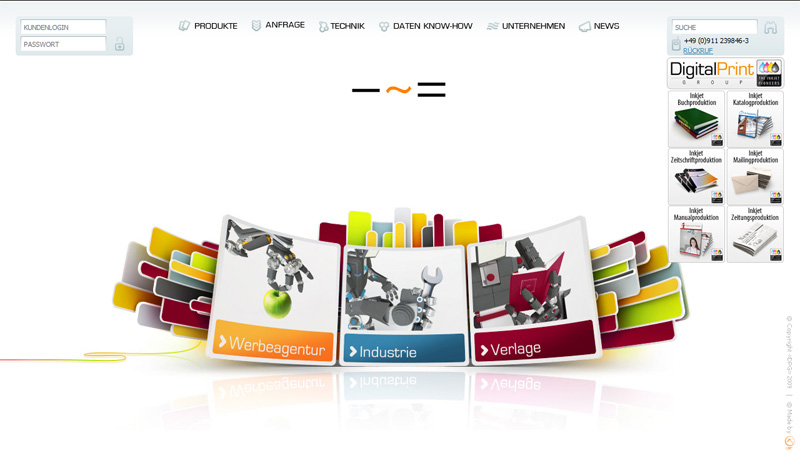
Digital Print
Don’t you find this product presentation rather unusual? Nontrivial things always grab users’ attention.
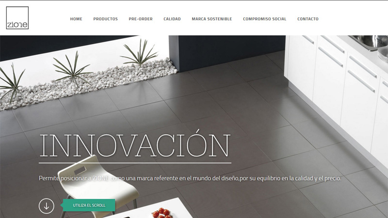
Zione
Very clean and elegant design.
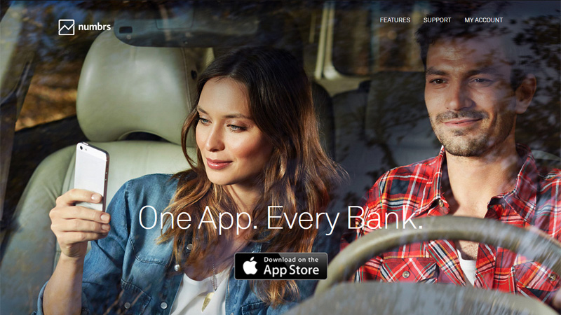
Numbrs
Nothing can be more interesting to watch than people’s facial expressions.
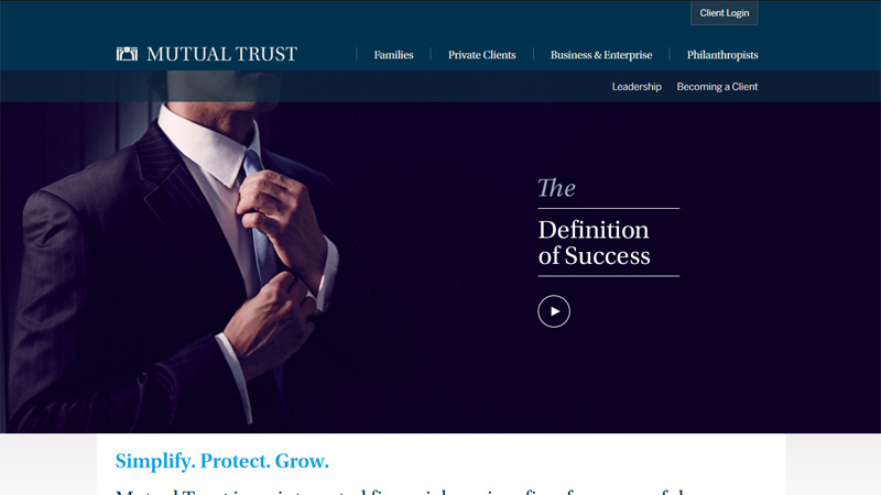
Mutual Trust
Here is an example of a traditional serious, trustworthy business website.
Don’t You Think That It’s Time For The Conclusion?
In virtue of everything stated above we can answer the main question of today’s blog post, i.e.: Is prim, corporate design good for your business? It’s our strong belief that everything depends on the type of business you are in. Only one thing is undeniable – nowadays, no matter what size your business is, it needs a quality online presentation. Your website will convey the feel of the company and tell all essential information about its products and services better than any words during a telephone conversation or even personal meeting.
Browsing your website is like an excursion. It guides the visitors through your company office premises, where all employees are at their working places greeting them with warm smiles and ready to cater to all their wishes. Frankly speaking, today, if your business is not presented online people don’t take it seriously. It can’t be considered open, transparent and welcoming to new customers. Furthermore, even a small business can’t allow itself have a cheap, ugly website.
Contemporary web is becoming more and more wonderful and user-friendly day-by-day and the users become choosy as well. They require everything in one pack: visual appeal, responsive design, nice colors, cross-browser compatibility, advanced options panel, live support, simplicity, readability and whatnot. Above, we gave you a bunch of practical advice on how to make your business website the one your customers are expecting.
As to its design, a prim, accurate style is good for bankers, lawyers, car sellers, undertakers and similar professionals, where dark colors, sharp lines, serious images and elegant typography help to justify the expensiveness of their services and convince the customers of their clean slate. It’s obvious that if you own a tour agency, toy store, event planning company, etc., prim, corporate style will look absolutely out of place.
Image credit: Bigstockphoto