From InstantShift – http://bit.ly/1tzOHea
Design elements that made their mark in 2014 will keep their prominence in 2015. As many know, there have been many killer trends in web and graphic design industry this year, but as we look ahead there are some predictions to look forward to in 2015.
The aim for designers now is to create sophisticated and less complicated designs, which is why there are signs of some trends that will make waves in the year 2015.
Responsive Design
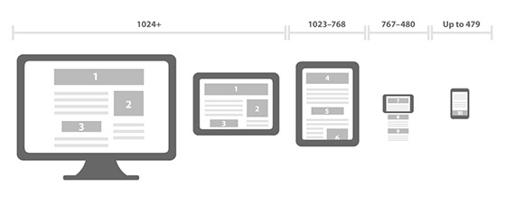
It has already become an indicator for web design in today’s world as Internet usage has changed to a great extent. An increasing number will take to searching on the Internet by way of their handheld mobile devices, which might naturally mean that the significance of responsive design grows additional in 2015. You know how difficult it is to get the eye of customers on your website, and if it’s not responsive to be user friendly on mobile devices, then you are alienating potential prospects. Developers won’t have to have a look at completely different designs for various devices and users won’t have to deal with tedious websites for their individual devices.
Increased use of flat design

Flat design is definitely not a new concept but its significance will enhance further in 2015 as the emphasis will be on keeping things simple. Patterns, textures, shadows, gradients and bubbles that are passé will give way to simple and flat design. Again the impact of people using handheld devices to surf the Internet shows because designers will have to bring up interfaces that are simplistic and look smart on flat screens as well. One of the highlights of Flat Design is that it takes you back to the days of solid design and that’s definitely a good thing. After all, web design should be rated based on how it works loads and being user friendly. Flat design works well on all these counts.
Infographics: A mix of everything

As far as web design is concerned, Infographics are definitely appealing and importantly, they offer you an opportunity to display a whole lot of information in a single space. You can make the most out of imagery, typography, bold colours and a whole lot more to give your information that bit of personal touch. The purpose of Infographics is simple; to give your users information in a clean and easy to understand, interactive format, which will keep their attention for a long time. But in order to create infographics that hit the spot, you will have to bear in mind the design element along with science to get it just right.
More Scrolling

There’s no place for bulky websites that break the information into several pages, anymore. Users today want to scroll down to find all the information you offer on a single page. It is true that multi page websites have a greater potential for search engine optimization benefits, you have to realize that single page websites are making their mark with Smartphone and tablet users today. It is definitely a trade off that you have to look into carefully. Of course, designers will not be able to include all the elements that would bring them SEO benefits but it does seem appealing to a large number of users today. The trade-off has minimal impact when your website is only a part of the complete digital strategy.
Parallax Scrolling

As we talk about scrolling today, the importance of parallax scrolling cannot be overemphasized. Remember, a quality website design is one that gets talked about. In present times one of the fresh trends that have made a big impression is parallax scrolling. It certainly has that wow factor, which is seen on the website’s front page, and that’s why there are many companies that have already switched to it. This design element is ideal for storytelling and you can also show different backgrounds and objects moving around at different speeds. It thus creates an impressive visual display that will wow your audience.
Personalized UX

Cookies have been around for a long time now and they serve the important purpose of tracking user activity so that relevant content is displayed to them in the future. Their use has increased to a great extent because of better designs that have come into play in the industry. You will notice sites like YouTube and Netflix already use them to remember things you have been watching to be able to suggest what you should be watching next. This option gives a lot of flexibility and choosing power to both, the designer and user.
Typography rules
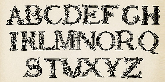
Just like content is the king for your website, typography holds the key to good web design. Typographic art is definitely making its way into the mainstream because people are bored of Arial or Times New Roman that have been used just too many times. Now is the time to make the most out of custom-made typography style and use it for virtual as well material aspects of your marketing campaign. There was a time when small businesses would have to pay through their nose for high quality, complete font sets but the good news is that they are now available to you at reasonable rates. Impressive typography was already a trend in 2014 and it will become more and more important in 2015.
Card design will rule the roost too
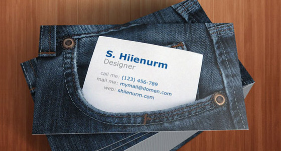
Card design has several benefits for designers who want to create responsive designs. With the help of this tool, designers can make sure that things are kept modular while arranging and rearranging is a lot easier to avoid things from getting disorganized at any point. It’s also helpful when it comes to browsing huge amounts of data. Quite simply, card design offers everything that web wants today; simplicity, cleanliness and of course, a lot of versatility.
Incorporation of HTML 5 Videos
It’s not so much about promotional videos but HTML videos that you can run in the background of your web pages. It’s a known fact that your brain can process visual images a lot faster than any other kind of information, which is why this strategy gives you an opportunity to showcase your biggest strengths in a matter of seconds. There are several ways through which you can embed videos into the HTML pages and there are many companies that have used this technique to their advantage.
Big sized, gorgeous background images and videos
Another design feature that will definitely make its presence felt in 2015 is large and beautiful background images and videos. Designers are staying away from putting out too much information because it is a turn off for readers. Having a simpler design means your website can stand out from the rest easily. You can have an appealing and relevant image with call to actions and important information that is overlayed on the top. It will give out your messages loud and clear while getting the attention of your users instantly. It makes a lot of sense for mobile users because they see images on their phones over tricky to read text.
Ghost buttons
They actually function quite well with images and videos in the background, which is why their popularity will definitely be on the rise in 2015. Ghost buttons are also preferred by designers because they are simple, sophisticated and elegant as well. That’s why they make your website look quite classy. They fit into the background discreetly as they only have an outline and they don’t seem too pushy. Unlike skeuomorphic buttons they are not screaming for attention but they still get their due, which is what you want.
Microinteractions

This is an upcoming trend after material designs and should be given its due importance. For starters, it is a contained experience or moment within a product meant for a single use case. It could be in the form of an email signup box that pops up on some websites. When it does its wiggle on the screen, it instantly gives a touch of personality to a static graphic. Microinteractions are meant for that added user engagement and to give a more personal experience, which is often appreciated.
Interactive storytelling

Today’s users will not be content with just information on screen, which is why designers are finding ways to share stories with them. It also leads to increased engagement but you have to understand that not all sites are meant for a lot of storytelling. However even in cases of hard-hitting journalism you will find that interactivity has its charm amongst users.
Page Fold is a thing of the past
Multi page websites, as we mentioned before, have their advantages for SEO purposes and can be seen as a smart tool for optimization. But more and more users are browsing on mobile devices and clicking on navigation link can hamper their experience seriously. Mobile users would much rather scroll to sections on the page rather than clicking to navigate. Making the most of this trend, there are several websites that are being created with a single page setup. Panels can also be used to great effect to ensure that mobile users have a more satisfying experience on the site.
Say a lot more with less

Text heavy websites are on the downslide because the visual appearance is becoming more important on the Internet. Hence instead of offering large paragraphs of texts, you will have to device ways to tell stories simply and in a more appealing manner. Text has been cut down to minimum and imagery including infographics, large images and icons will be used to telling effect.
In case of websites that are naturally text based by nature, the trend will be focused on content that is quite rich. Text can be used in combinations with video and images for effective storytelling to hold the attention of users.
Modern Metro
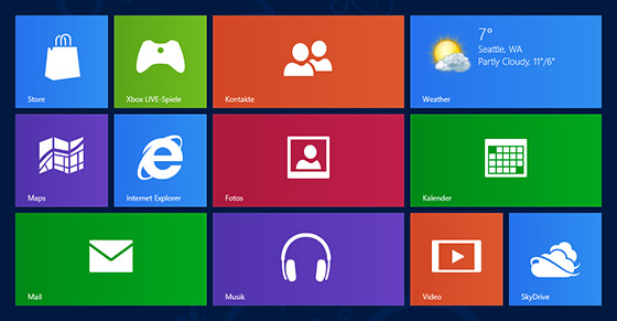
Introduced by Microsoft with Windows 8, it has already been used by sites like Instagram and Pinterest. Metro design has become hugely popular with designers and here the title has a photo, text and a small entice in some cases to attract users. Tile design is here to stay because its impact can go a long way, especially in tandem with personalized websites. As tiles are interchangeable and flexible, they have their merits for recommendations or to showcase personal information, like in the case of Pinterest.
Personalization and optimization rather than innovation
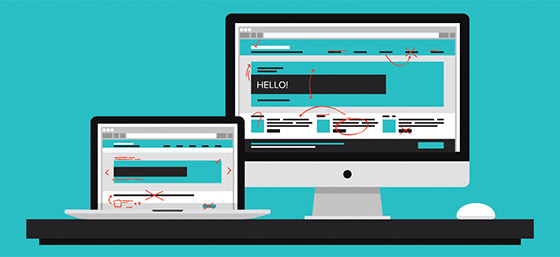
More than path breaking innovations, 2015 is going to be about the character of optimization. The challenge is not to come up with new design trends but in the form of old Responsive designs to be optimized. These surfaces will have to be worked out so that they work on both, small and big screens. Personalization will also be a problem in the future because web content today is fused with everyday user and user experience will have to be an individual one.
Conclusion
These trends of 2015 are not going to revolutionize web design by any stretch of imagination. However it definitely paves a way for interacting with users, which is why they should be paid attention to by web designers. They can help consumers engage with brands and create a much better user experience.
