By Elena Terenteva, from ‘Net Features – http://bit.ly/1sU25Ir
Landing pages rock, fact.
- They help you target your message to very specific audience needs.
- They are persuasive.
- They help focus the reader’s attention on your offer.
- And they convert.
In short, there’s no better way to make a sales pitch online than through landing pages.
There’s just one problem – creating them takes time.
It’s partially due to how long it takes to formulate and test ideas. From design elements to your offer and the way to get it in front of your audience, you need to consider it all and more.
Yet there is someone who already has that knowledge – your competitor.
And a quick glance at the way they do things can help you find new or more productive ways to build better landing pages.
I’ve already written about the benefits of competitive research online. Below are some ideas on what to look out for when you analyze landing pages specifically.
Usability
To convert, visitors must be able to use your page. If they stumble even on a tiniest roadblock when making a purchase, or completing any other action you intended for them, they’ll abort it.
There are four most common usability problems you find on landing pages:
Poor Headline
Bob Bly, a recognized copywriter, states that a headline should perform four different tasks:
- Grab the reader’s attention
- Specify who the page is for
- Deliver a complete message
- Draw the reader to read the rest of the page
But if executed poorly, a headline can defer visitors from reading your page and ultimately, completing the desired action.
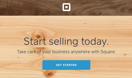
Square features a brilliant “Start Selling Today” headline. It immediately catches attention of the target market (businesses) and is intriguing enough to get you to read the rest of the page.

When analyzing your competitors’ headlines, pay attention to:
- The length of their headline
- How they define the target audience
- How clear are they about what the page is about.
Lack of or Unrecognizable Trust Marks
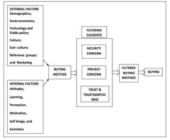
Trust is a major issue online. In 2012, two management professors, Ujwala Dange from Priyadarshini Engineering College and Vinay Kimar from S. B. Patil Institute of Management developed this model for online customer behavior:

In their model, they identified security concerns as major filtering element that might prevent the buyer from completing the purchase.
That’s where trust marks come in.
Placing a trust mark logo on a landing page, especially close to a call to action can reduce the reader’s security concerns.
Econsultancy however discovered that trust marks work only if customers recognize the logo. And one way to find out what logos your audience might know is by checking what security and trust accreditation your competitors display on their landing pages.
Confusing Calls to Action
A call to action is one area of landing page that must be thought through and tested. After all, you don’t want your visitors to keep wandering off the page.
Yet a 2013 study by OnlineMarketingCoach discovered that 70 percent of B2B websites lack a call to action. And without it you leave it to the visitor to figure out what you want them to do on a page – buy, sign up, try the demo or see a video for instance.
When reviewing your competitors’ calls to action, pay attention to the following:
- Their call-to-action copy. Is it very modest (“Check our video”) or demanding (“Watch the video NOW!”)?
- How many times the C2A (call to action) is displayed on a page.
- Is it clearly visible?
- Does your competitor use any visual clues (e.g. arrows or images of people looking at the button) to draw attention to it?
- Is there only one or a few distinct C2As? And if there are few, how do they highlight which one is the most important (size, color, placement)?
- Do they repeat the C2A below the fold?
Weak Offer
An offer is what you want to give your visitors in exchange for taking the action. It can be anything from discount on first purchase, coupons, free trial of your software, an eBook, industry report or anything else your audience might find attractive.
However, if your offer isn’t strong enough, your readers might ignore it and take no action.
Your competitors might already know what offers will work for your audience. And thus things to look out for at competitors’ pages are:
- What do they offer in return for completing the action
- How do they convey the offer? Do they make it simple to understand or confuse the visitor as to what they are really getting?
Marketing
Usability is of course a key factor in conversion, but getting Web visitors to your landing pages is equally important. Here’s how to optimize landing pages with a little competitive keyword research.
Keywords
One of the key roles of a landing page is to bring targeted traffic. For that to happen, it needs to be optimized for specific keywords.
And one way to find out what are the best keywords to target is by researching your competitors’ strategies.
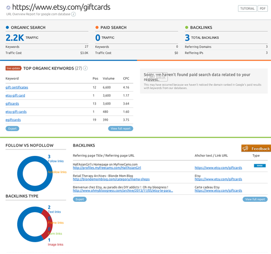
Some keyword tools give you the ability to research any URL for keywords criteria.
The information you should specifically pay attention in the report include:
- Organic Keywords. This can reveal not only their marketing strategy but what kind of specific audience your competitor targets.
- PPC Keywords. Similarly, if your customer is promoting the page with AdWords, you’ll find out what keywords they bid on.
- Keyword Search Volume. This metric reveals how popular the keyword is.
- Position. Where does your competitor’s page rank for a particular keyword.
- CPC. Before you start bidding on a keyword, find out how much does it cost to bid on a particular keyword.
On-Page Optimization
Knowing what keywords to use is only part of the success. Optimizing the page for them however is what makes it successful in search engine result pages (SERPs).
You should therefore analyze how your competitors optimize their pages, and find out if there are any potential quick wins in their strategy:
- Do they include keyword in the headline?
- How many long-tail keywords they include in the copy
- What keyword they include in meta tags of the page
- How they optimize images
- Are they using any tags or any other form of organizing the page in the site’s structure?
Speeding Up the Process
Landing pages rock, fact. Unfortunately, creating them takes time. And often you need to test various ideas before figuring out what brings the best results.
To speed up the process, consider researching your competitors’ landing pages, deconstruct their strategies and identify quick wins you could avail of. Often you can also discover ways you can beat them within the process.
And that’s a great bonus.

