B Katie Lantukh, from HubSpot Marketing Blog – http://bit.ly/1LJN0GE
Perhaps their email inboxes overflow daily and they’re tired of going through and deleting each email. Or, maybe they had a bad day and spent their lunch break un-friending people andunsubscribing to email blasts.
In any case, it is important to provide a simple “unsubscribe” option so that the unqualified people on your list don’t skew your click, open and conversion rates. It will pay off for you in the long run if you trade a larger unsubscribe rate for higher clicks, opens and conversions.
Thanks to the CAN-SPAM Act, we know that we have to give people a way out. There are simple ways to speak through an unsubscribe option and there are comical ones. Here are 9 different examples of unsubscribe pages that bring a fresh take on the email breakup.
1) J.Crew Factory
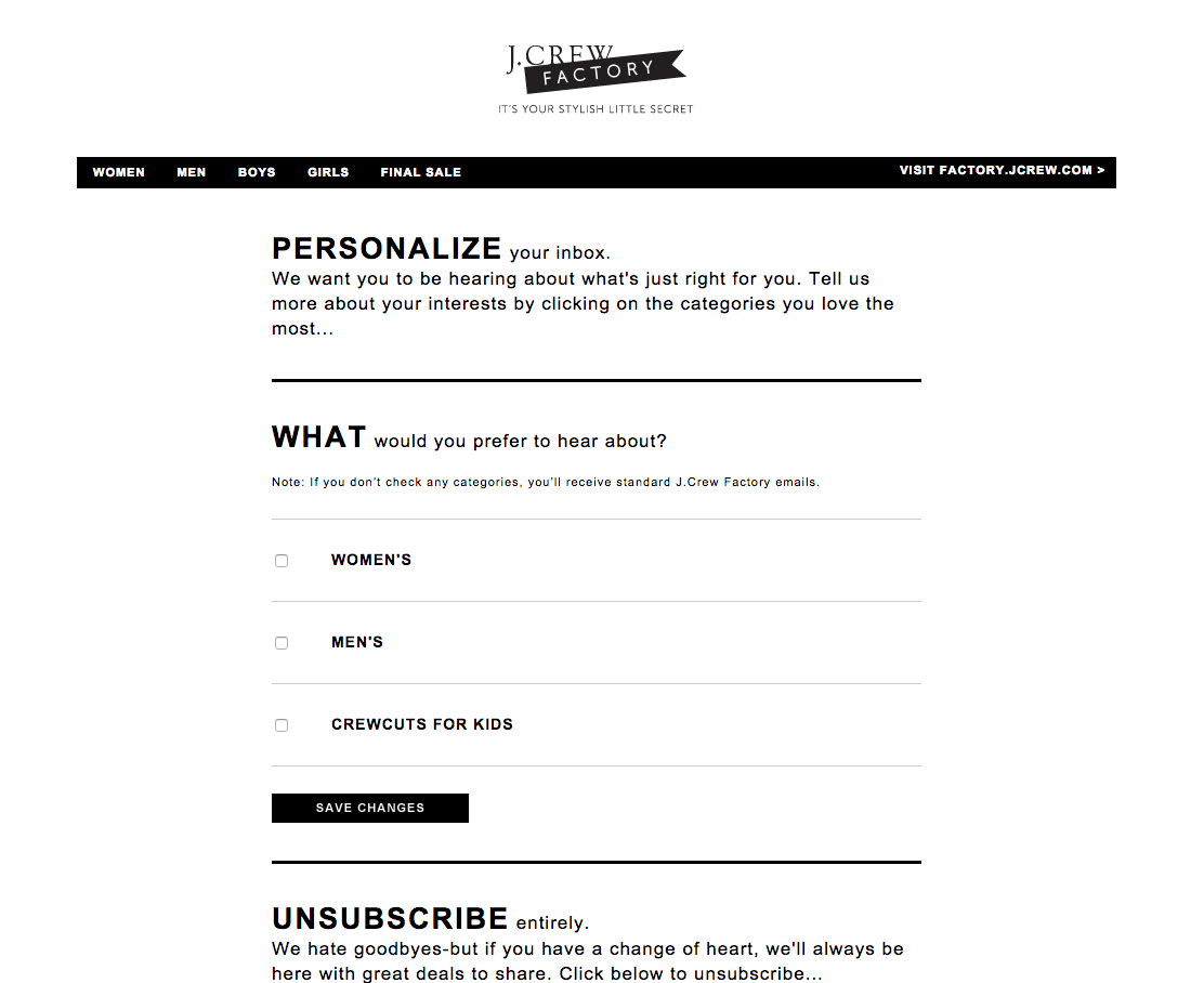
J.Crew’s unsubscribe page recognizes that all email campaigns might not be specifically reaching the right people, so they enabled the option to personalize your inbox. The language on this page fits right in with J.Crew Factory’s personality: it’s a casual and classy combo that leaves users feeling like they have control of their future inboxes.
2) Barneys New York
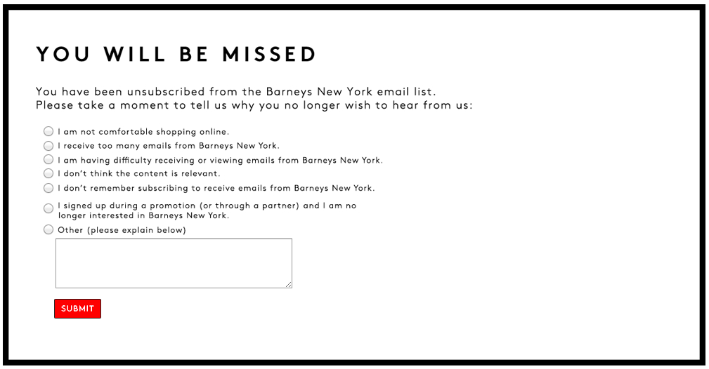
Barneys New York provides a characteristically classy “You will be missed” message and a simple survey for users to note why they are unsubscribing. This one-step unsubscribe process is simple for subscribers and still effective for the marketing team at Barneys to adjust their email campaigns as needed.
3) Puma
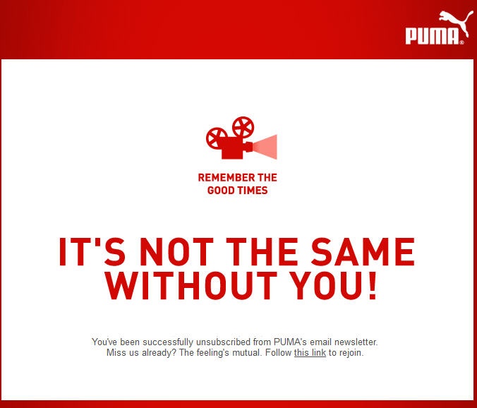
The playful, athletic brand Puma takes a more lively approach with their unsubscribe confirmation page. They show an icon of a movie reel with the text, “Remember the good times,” and a CTA to rejoin if they would like to re-subscribe.
While many users will likely stick to their original decision to unsubscribe, it’s also possible that many will appreciate the humor and sign up again.
4) Bed Bath & Beyond
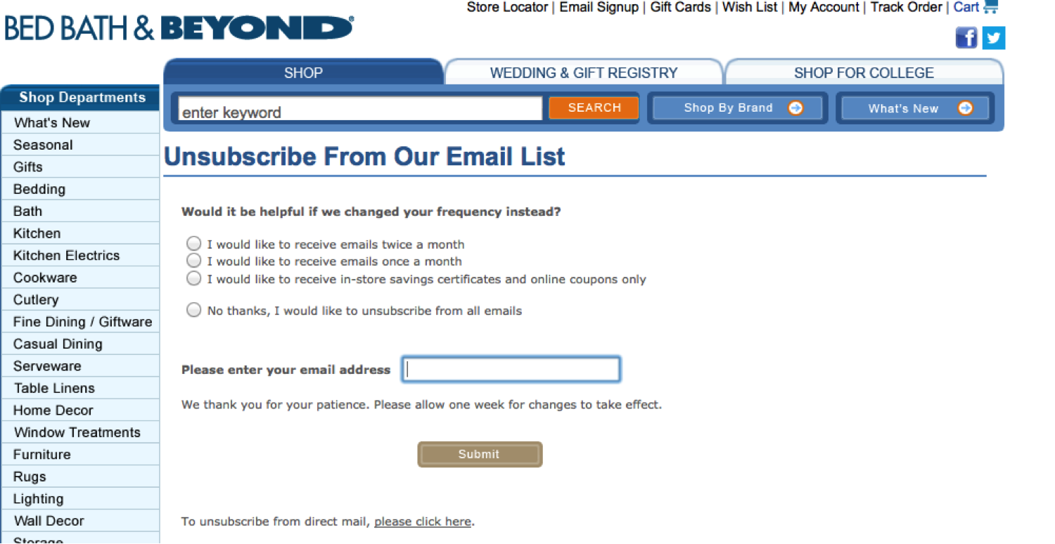
The home wares giant, Bed Bath & Beyond, takes users to a page that allows them to adjust the frequency of their emails. We recommend that rather than giving users the choice between receiving or not receiving emails, you should give them more choices – either choosing which types of emails to receive like J.Crew does or choosing how many emails they would like to receive, like Bed Bath & Beyond.
5) Free People
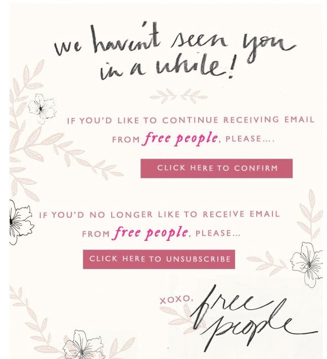
The thoughtful clothing company, Free People, notices that subscribers haven’t been interacting with their emails and they send a friendly note asking if they’d still like to receive their emails.
This may prompt subscribers to start engaging with Free People’s content again, but it may provide a friendly opportunity to unsubscribe from their mailing lists. True to their brand, the unsubscribe page is girly with its floral design and “handwritten” typefaces.
6) charity: water
The clean water non-profit, charity: water, gives readers the option to confirm their opting out or to watch their CEO get doused with water in the “clean water treatment.”
charity: water provided insights to their results: out of over 70,000 emails that were sent, 100 unsubscribed and 740 watched the video.
If it is appropriate for your brand to make a lighthearted video along these lines, it might be worth a splash of water to see an unsubscribe rate at close to one thousandth of a percent.
7) Sidekick
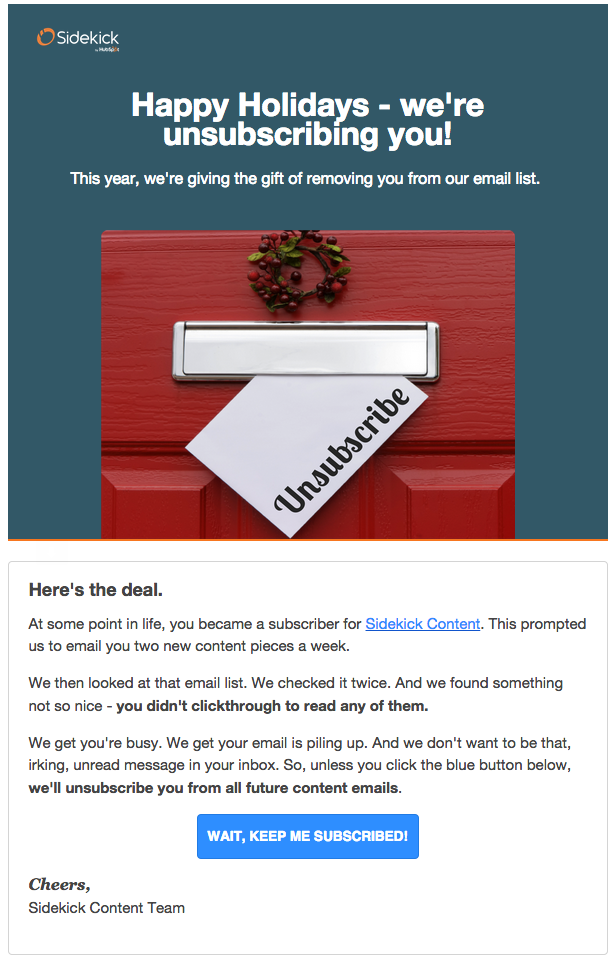
Like Free People, HubSpot’s email tracking function, Sidekick, sends an email to their subscribers who have not been interacting with their emails. The email says, “Happy Holidays – we’re unsubscribing you!” with a CTA at the end – “Wait, keep me subscribed!” This way, people don’t have to make the awkward choice to unsubscribe and it also simplifies the process – they literally don’t have to do anything! If they want to remain subscribed, they click one button. Simplicity at its finest.
8) Fab
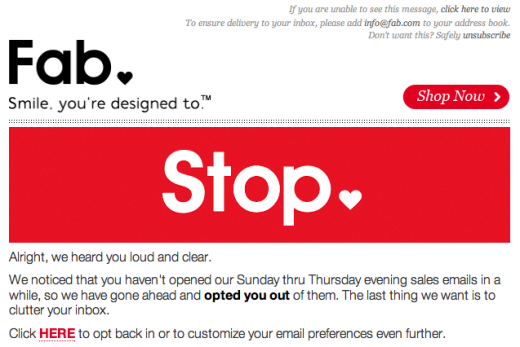
Using the same strategy as Sidekick, Fab also automatically unsubscribes users who have ceased to interact with their content. Their large “Stop” banner is likely to catch the attention of readers and gives the option to re-subscribe to their email campaigns if they choose to.
9) Groupon
When you click “unsubscribe” at the bottom of a Groupon email, you are taken to a screen to confirm your decision. Upon confirming, you land on a page that has a gif of a man named Derrick sitting at his desk.
By using a little humor and personality, people who unsubscribe likely leave Groupon with a positive view since they weren’t begged to stay. Readers may even experience some level of gratification for having seen Derrick punished for their annoyance over the emails. Win-win?
Why Do They Work?
There are three recurring tactics used in these examples:
- Provide a way out with an unsubscribe link on all of your emails and/or give subscribers a way to personalize their inboxes.
- Conduct a wellness check by sending out an email asking, “Are you getting too many emails? Let us know and we’ll try not to bother you again” or something along those lines. That way, you’re giving your subscribers a choice – they can unsubscribe guilt-free or they will start reading your emails again after being re-engaged.
- Introduce humor. If a simple “We’re sorry to see you go” is too serious for your company, try emulating Groupon’s unsubscribe page.
In addition to crafting an effective message, it’s important to note that not all marketing automation systems are set up for simple unsubscribes. Make sure that no matter which platform you’re using, you honor the requests to unsubscribe. And if you’re wading through unsubscribes, don’t be discouraged! It’s a normal part of email marketing – remember that you want to reach the right people, not just as many as possible.
What email unsubscribe pages have you seen that you’ve enjoyed? What is your marketing team going to try in this fresh, new year? We want to see what you come up with! Curious about what goes into an effective email marketing campaign?

