
By Melanie Perkins, from Inbound Hub | Marketing – http://bit.ly/1qS7h02
When you think of all the things that make up a good design, what elements come to mind? Color? Layout? Photography?
Most people often forget that typography plays a crucial role in the success of a new design. With so many choices, choosing the “right” one can feel overwhelming. But the good thing about fonts is that a little bit of knowledge goes a long way.
If you’re not familiar with the basics of choosing and tweaking fonts to enhance a design, keep on reading. Below are my 10 favorite font tips. These skills are all actionable — so it’ll be easy to try them in your next social media or marketing campaign.
1) Break your text up into separate text boxes.
When people are first starting out in design, they often use one text box on their page that has the same font and spacing throughout. However, uniform fonts and spacing certainly doesn’t capture a viewer’s attention.
Instead, try splitting your text out into separate text boxes. You’ll be able to have a lot more fun as it’ll be easier to experiment with fonts, sizes, and colors.

2) Think about the positioning and alignment of your fonts.
When you are placing your text in your designs, ensure all of the text boxes have the same alignment. Generally the choice is between: left alignment, center alignment, and right alignment.
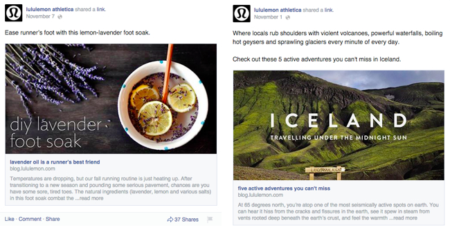
Lululemon Athletica has demonstrated two different options on their Facebook page. In the first example above, a cover image for a blog article, the text is left aligned. In the second example it’s center aligned. In both of these examples the text has been positioned to suit the background image spacing — which is an important factor in determining how to place your text.
3) Match the font style to your brand’s character.
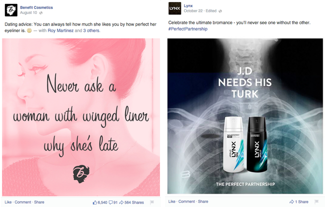
Selecting the right font for your design or brand should be done carefully and thoughtfully. Keep in mind that a font should embody the character and spirit of your brand, as demonstrated in these examples. See how Benefit Cosmetics use a feminine script font on their Facebook graphic, compared to Lynx’s more masculine geometric font?
4) Make sure your text is easy to read.
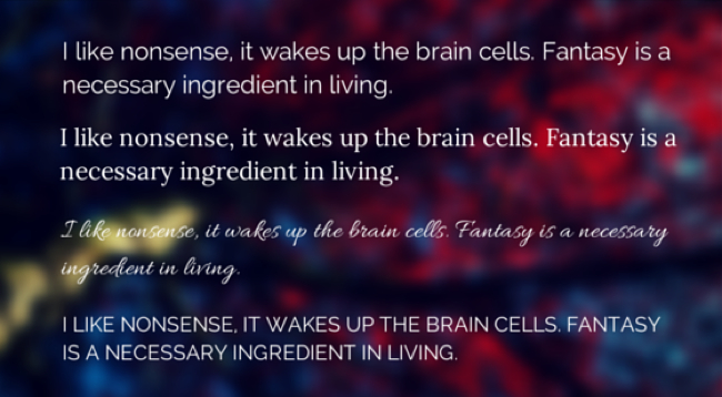
It’s important to ensure that your font is readable, especially if you’re using it for longer bodies of text (like in presentations, pitch decks, and infographics). Avoid using elaborate script fonts or uppercase text in large bodies of text as it forces strain on the reader’s eye and makes the overall text much harder to read. See what I mean?
5) Play with different font sizes.
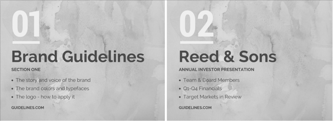
Using different font sizes in your designs will help create hierarchy — the order in which text is read. The eye is naturally drawn to large or dominant elements, so choose the largest font size for your title, followed by your subtitle, then your body text.
6) Experiment with all caps.
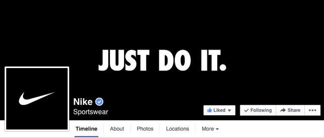
When starting out in design, most people opt to always use sentence case. However, for small amounts of text — especially your title or subtitle, all caps (capital letters for every letter in the word), can be very effective for a strong, modern look.
Nike use this technique effectively on its Facebook page to create emphasis for its banner image and call-to-action style graphics.
7) Try playing with letter spacing.
Letter spacing, also known as tracking, is just that — the space between letters in words. This can be increased or decreased manually in Canva. Increasing your letter spacing will help your type breathe, while decreasing it will tighten your type.
Letter spacing is also a great way to make different lines of text the same width. See how this has applied in the example below — the symmetrical line length creates a more balanced feel to the graphic.

8) Experiment with different font pairs.
Choosing fonts that complement each other is an essential design skill. When used together, different fonts create different effects. For example, the graphic below combines a decorative script font (‘Sunshine’) with a geometric sans-serif font (‘The bright side’), which balance each other out nicely. This is a jazzier font pair, which is great for social media designs.

It’s a good rule of thumb to choose font pairs with high contrast. Take another example — a tall and short font pair. Tall fonts have a strong condensed nature, which creates a great basis for contrast with the shorter, more spacious font.

9) Make sure you place your text where it can be easily read.
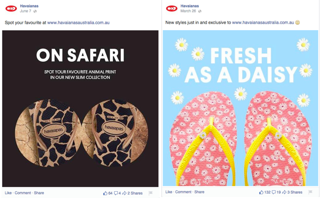
Clear, open areas that are great for placing text are referred to as copy space. If you’re working with images that have a lot of copy space, your text will pop in these empty areas. See here how Havaiana has created eye-catching designs for its Facebook page by placing text in copy space:
10) Reduce the quantity of text.
When you are designing, it is just as important to think about what you are saying as how it laid out on the page. Can you reduce the amount of words and say the same thing more succinctly? Could a concept be displayed as an image or diagram instead of a paragraph of text?
Design isn’t just about how it looks, but how you communicate. This graphic uses a visual element, the Twitter icon, to replace the need for more text saying “on Twitter.” When you are putting your design together, continuously examine if you could articulate a concept more clearly with icons, images, and photographs instead of text.

Putting These Tips Into Action
Fonts play a critical part in almost all designs — from Facebook marketing graphics to album covers for artists. Don’t be afraid to give these tips a go yourself. They’ll help you create designs you can proudly share with the world — even if you haven’t had any prior design experience.
With some basic design knowledge and a willingness to try, you’ll be amazed at how a clever application of fonts can improve your marketing and branding graphics.
