By Alan Schill, from Search Engine Journal – http://bit.ly/1vWXQl6
Imagine if you had an amazing SEO strategy that drove large amounts of organic traffic combined with a perfectly optimized PPC campaign that pushed even more targeted traffic to your website. Life would be great, right?
In theory it sounds amazing, but all of the traffic in the world is completely useless unless it is converting into sales and leads. The landing pages you push traffic to need to convert your visitors, so I am going to discuss 10 tweaks you can make to improve your conversion rates.
1. Optimize Your Form Fields
Your visitors will pass on your offer if you ask for too much information. First, people are extremely lazy and if your lead capture form looks like a chore they aren’t going to be interested. Second, with so many data and security breaches in the news these days consumers are extra cautious when putting their sensitive information out there.
Quite simply, the more information you ask for, the lower your conversion rate is going to be. Some of your visitors will see multiple form fields and instantly not be interested, while others might start to complete it but then leave without completing it.
Every website is going to require different information, so there is no concrete rule as far as which fields to ask for. It boils down to determining the least amount of information you can ask for while still create a valuable lead.
If you are just building a newsletter list do you need to ask for the visitors first name, last name, phone number, email address, address, city, state, and zip? Of course not, and most visitors would not give you all of that information. You could get away with just asking for their name and email address. That is all of the information you need in the beginning. As they move through your funnel you can then ask additional qualifying questions or request more information.
Some landing pages are going to need much more information in order to produce a quality lead. Let’s take a mortgage lead, for example. The lender will require much more than just a name and email, but they can still optimize their form in a way that will produce a high percentage of conversions.
Take a look at this form for a minute:
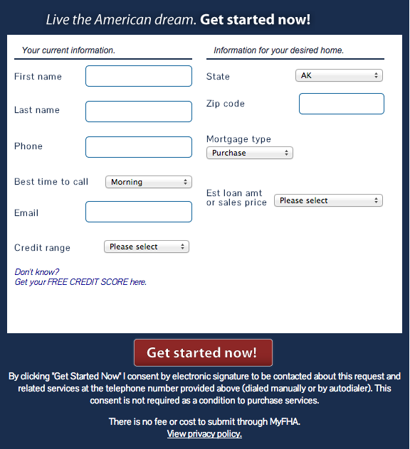
This is the first part of the process that the visitor sees when they express interest in receiving a rate quote for a mortgage. Asking for all of that information right off the bat might scare some people away.
Now take a look at this form:
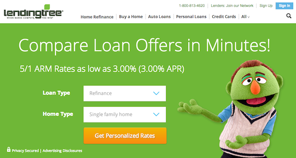
Not only is it more visually appealing, but it only requires the visitor to select the loan type and home type that they are interested in. This is a very simple first step that doesn’t ask for too much personal information right away. As they move through the process, it asks for one thing at a time. This is a smart approach because it doesn’t overwhelm the potential lead.
Make your lead capture forms as short as possible, and if you need a lot of information to create a quality lead, then present your form in a creative and noninvasive way like the example above.
2. Showcase Social Proof, Awards, & Accomplishments to Build Trust
Your visitors are more likely to convert if they trust your website. You have probably seen websites with images of national media outlets they have been featured in, and it is because it helps to build credibility. There is no need to clutter your landing page with logos, but a few select images can greatly improve your conversion rate if they are prominently placed.
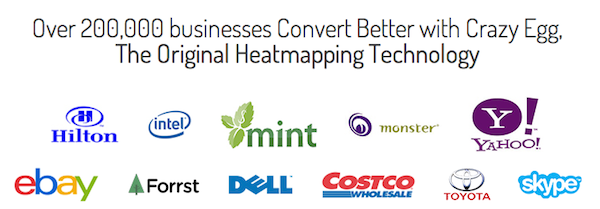
Crazy Egg has a very simple landing page with images of some popular brands that use their heat map technology. These are brands that everyone can relate to, building instant trust.
Also, make sure badges of trust link out so that your visitors can confirm that they are legitimate claims. For example, if you have an Accredited BBB logo on your landing page make sure that it links out to your Better Business Bureau profile. Many “scammy” landing pages will feature the logo but they won’t link out because they are not actually accredited. Consumers are becoming aware of this and they will want to verify anything that you reference on your website.
3. Feature Customer Reviews and Testimonials
Adding testimonials to your landing page can produce great results when done correctly, but they can completely backfire when done incorrectly.
Have you ever visited a website that featured testimonials that read something along the lines of:
“I am now a millionaire because of this!” – D.H.
“You will not regret this!” – Bob
“This solved all of my problems!” – Chris
Those examples reek of complete BS. The visitor automatically assumes they are fake and instantly loses all trust in the company. There is no reference of the company or organization, and the names used sound extremely fake and made up.
Take a look at how Raven presents their testimonials:
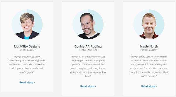
They include the name of the company, an image of the individual providing the testimonial, and a link to read an in-depth review. This is what effective testimonials should look like. There is no doubt that these are genuine.
Whatever you do, make sure you use 100% true and accurate testimonials. Do not hire someone to write fake ones. They are easy to spot!
4. Use Live Chat on Your Landing Page
Live chat is a great way to catch visitors who don’t want to fill out your form or call your company. Some of them may not want to immediately give up their contact information before some of their questions are answered and some won’t call your company because they fear there will be a sales rep on the other line with a bad case of commission breath.
A live chat on your website allows your company to interact with visitors who might have left your website otherwise. Worried it will reduce the number of leads you produce? Think again, because many of the chat programs allow you to configure it so the user must enter his or her name and email to connect with a live chat representative. So, you collect your lead regardless!
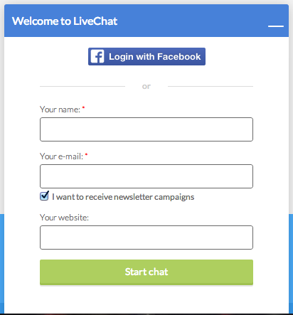
Your live chat agents can then answer any questions the visitor might have about your product or service and ask qualifying questions. Don’t be surprised if you see your conversion number increase dramatically after installing live chat.
5. Give Your Visitors Direction
You have only a couple of seconds to get your visitor’s attention, so make sure you tell them exactly what you want them to do when they hit your landing page.
Are you trying to get them to complete a lead capture form? If so, make sure there is a big arrow pointing to that form! Take a look at copyblogger’s free e-book offer. That very simple arrow shows the visitor exactly what they must do in order to receive the e-book.
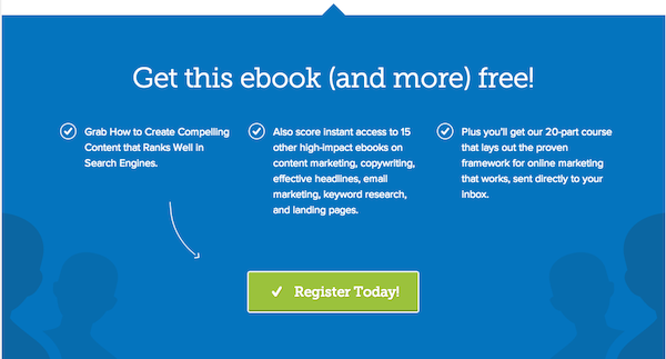
You don’t need loud obnoxious animated arrows. The example above is a very clean design with a simple arrow that does the trick beautifully. A simple tweak like adding an arrow can help push your visitors to complete your CTA and increase your conversion rates. Test multiple directional elements to find out what works best for your website and audience.
6. Split Test Button Text Variations
If you look at the text on the buttons of most calls-to-action you will notice they tend to be the same.
“Download Now” tends to be the main text that you will see on 99% of all CTA buttons. Try additional text to see how your visitors respond.
Some examples of additional text-based on the common example above could be:
- Get My eBook Now
- Download Your eBook
- Instant Access
- Instant Download
- Give Me It Now
Don’t over think this process. This is the beauty of split testing! You could make the slightest change and see a huge increase in conversions. Start with several options and then begin eliminating those not producing results. Eventually, you will find the winning combination for your offer.
7. Split Test Button Colors and Sizes
You want your buttons clicked on. You are spending time and money to drive visitors to your landing pages and you have one goal – to convert them. This requires that they click on your buttons! What if your button is the wrong color or the wrong size? That couldn’t possibly reduce your conversion rate, could it? You bet it could!
Your button color needs to stick out like a sore thumb. Your visitors need to be able to see it right away. If your website is all blue, don’t have a blue button. Many designers like to keep the layout uniform, but that isn’t going to help your conversion rate at all. You need your button to jump out at the visitor immediately.
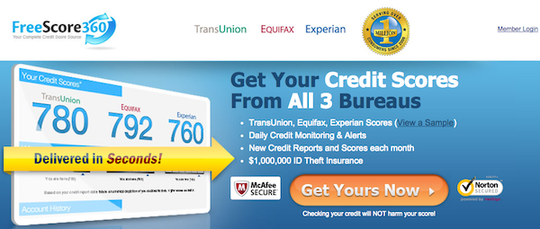
Take a look at Free Score 360’s landing page. They have a bright orange button that immediately grabs your attention and lets you know what action you need to take.
Here is another example from unbounce. They specialize in optimizing landing pages, so this should give you a great idea of how important it is to have a button color that sticks out.
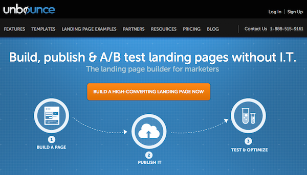
Both of the examples have a blue base and used an orange button. This is a very popular color combination, but don’t think you have to change all of your landing pages to a blue and orange combination.
Find a color that really stands out against your background and the overall color theme of your landing page. If there are multiple options, split test them all to see what colors pull the highest conversion rate.
You will also want to test multiple button sizes. Some sites do well with normal sizes while others excel when they use huge ‘in your face’ style buttons. There is no way to know what will perform better unless you test all possible options.
8. Stand Out and Be Memorable
Let’s take a look at GEICO’s landing page form:
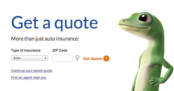
GEICO’s mascot is known worldwide and when people see it they immediately associate GEICO with the character. This instant recognition works in their favor, and that is why you will see that gecko lizard displayed next to all of their lead opt-in forms.
They created a memorable face (or gimmick) for their brand and they now use it to help increase their conversion rates. When someone is online and they type in a search term such as “get car insurance” and they land on a GEICO landing page the presence of that lizard automatically helps their conversion rate.
When GEICO’s marketing department was pitching the idea years ago do you think some executives were a bit leery of basing their marketing campaigns around a lizard? There were undoubtedly some that were hesitant, but guess what? I turned out to be a brilliant move, proving that standing out and being memorable can pay off big time. Don’t be afraid to be different!
9. Use an Explainer Video
An effective explainer video can really help to increase your conversions. Why? Because we are all visual learners. Instead of creating a landing page packed full of text explaining why your product or service is so good, why not create a 60 to 90 second video that accomplishes the same?
Most visitors would much rather watch a video rather than read a bunch of information. A clever video will capture your audience and really drive your message home. If the visitor connects with the video what do you think is going to happen? When done correctly they will enter their name and email into any for you present them.
Explainer videos are very popular these days and many companies are using them, but not all of them are focusing on quality. If you do not have the proper budget to get a professional video created then don’t do it. A cheap video will make your service or product appear to cheap as well. Some may disagree, but an explainer video that you get on Fiverr or outsource for a few hundred dollars isn’t going to do the trick. A professionally done video with script, voiceover and flawless (and creative) animation can easily cost over $10,000.
If you want to see a great example of an effective and successful explainer video, then watch Crazy Egg’s video. It does everything the right way.
http://www.youtube.com/watch?v=v3f-2WG7ONc
10. Eliminate Unnecessary Text
Remember your landing pages are not there to explain every aspect of the service or product you are selling. That is what your main website pages are for. You landing pages should be built to serve one purpose, and that is to generate conversions.
The simpler your landing page, the better. It is very possible to have minimal text and a strong CTA and pull in a ridiculously high conversion rate. Your landing page is just the second half of the conversion process.
Take PPC as an example. The keywords you are targeting and your ad copy is the first step. This is what gets your visitors initial attention, and your landing page is there to close the deal. You will need some content on the page to help you generate a strong quality score, but you don’t need to put all the information pertaining to a product or service on the landing page.
Highlight the key benefits and have a simple CTA and form to make it very easy for the visitor to convert. Don’t over think and you will be fine.
Conclusion
When you begin to test different landing page tweaks, it is important to test one change at a time. testing multiple changes at once will not allow you to pinpoint what works and what doesn’t. Yes, it will take time, but it is well worth it because when you improve your conversion rate you lower your acquisition cost.
What landing page tweaks have you successfully used to improve your conversion rates? I would love to hear them in the comments below!
Featured Image: PureSolution via Shutterstock
