By Francis Santos, from Search Engine People Blog – http://bit.ly/1rNaWRZ
Your email marketing landing page holds an important key to your overall conversion success, so overhauling this critical page on your SEO website will pay dividends!
1. Comprehensible URLs
In order to reinforce your branding, your landing page URL should be as readable and short as possible. Not only does “download-100-ways-to-beat-google-panda-farmer-ebook.html” have a greater search engine indexing value than “googpndfrm498572947.html” but it will be readily identifiable by the reader in their address bar. This way they’ll know that they landed on the right page.
2. Nav bars rule!
Your landing pages should have nav bars to the rest of your website, intelligently structured to that they primarily lead to similar or complimentary offerings. Your “Panda Farmer” ebook customers will likely be far more interested in your “Top Secret List To The Best Article Marketing Sites” than they might be in your “Security & Conversion Tools”.
3. Scroll bars must die!
To accommodate the vast variety of screen sizes and resolutions, your landing pages should be as square as possible. If you have to go longer it should be on the vertical axis. Always resist the temptation to make your pages over-square on the horizontal as that will create side to side scrolling which is suicidal in the mobile web enabled device arena.
4. Repeat, repeat, repeat
Why should the call to action only be limited to your email link? As an SEO professional you certainly should know that net surfers are not known for their long term attention spans, so repeating the offer prominently on your landing page is going to increase the probabilities of a conversion.
5. Specific landing pages
If your email link leads to your generic home page, congratulations you’ve lost a sale. Home pages are designed to be all purpose welcome locations which provide an overview on the entire site, while specific landing pages should be logically sequential and fully exclusive extensions of the particular call to action you proposed in your email.
6. Landing pages & segmentation
If you are not segmenting your audience into particular demographic, geographic, and behavior subcategories start right now. As soon as you get that done, then you can set up carefully targeted landing pages to suit each group. Dumping all your responding subscribers indiscriminately onto a single blanket landing page will severely cut into your conversion rate success.
7. Consistent tone & leitmotifs
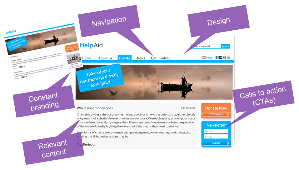
Harmonizing everything from color scheme to layout to font style to everything else at every step of the prospects progress through your online sales procedure will reassure the customer that they didnt end up somewhere else. Tone is similarly important: If your email is hip and young but you’re plunking them onto a gray business landing page choked with legalese, they’ll abandon you in droves.
8. Use a Super Hero Shot
Hero shots are the prominent and largest images on the landing page and they are the ones that most effectively convey in visual form the essence of your proposition. Hero shots should always be above the fold and if they relate in any way to your SEO product or service, they should be clickable. Presaging your landing page hero shot on your emails call to action will also play into the consistent leitmotif you should be providing your customers at every step along the way.
9. Take the top down approach
Your landing pages strongest reason for conversion should be set up top and large. The overall rationale of the offer has to be immediately evident at the very first glance at your page. As the reader moves down the page prominent and preferably bullet-set points should follow and the whole approach should be summed up in a boxed or otherwise highlighted call to action which leads to the checkout.
10. Sharpen the editing axe
If you cant read your entire landing page in less than fifteen seconds, start editing mercilessly. By the time you have your customer to this point you should have already educated them as to your proposition so the landing page must be a summary of advantages which lead the prospect to make that all-important click.
Shape up that landing page and get those conversions rolling in!
