By Tina Yeung, from ‘Net Features – http://bit.ly/1onLduq
Are footers out-of-date or can we make them better? The truth is, footers have been underestimated. We just don’t think too much about them but if we are trying to find ways to improve the Web experience, we shouldn’t neglect what’s at the end of the page. Like a story, the ending should be just as good as the beginning. An engaging footer provides guidance and helps direct the audiences to the information they seek.
Why You Should Pay More Attention to Footers
In a lecture class, I was taught to say my name at the beginning of a lecture and at the end because people most likely remember the first and last things you say. Whereas headers are given the most thought, footers have been pretty much neglected but here’s why we should pay more attention to footers:
- Footers are on every page just like headers.
- If a user can’t find what they want on the header they will look elsewhere and where else is better to put that information than the footer?
- There are footer conventions that users expect just like header conventions.
- Footers are expected to be guides. Like a bibliography, it should have some resources to direct users to explore further.
What should the user do when they’ve reached the bottom of the page? If we entertain the idea that people have been conditioned to think there isn’t much value at the end of the page, then it’s because of past experiences where footers have not provided them with enough information to make them pay attention. If this is the case, we can start by creating better footers that will allow visitors to learn that there is also something worthwhile at the bottom of the page .
We can build better footers that enable users to further explore your site instead of just stating copyright information that says “goodbye.” What kind of information? When designing footers, there are valuable conventions to acknowledge that will ensure an engaging result.
Footer Conventions
We never want to reinvent the wheel. That is to say that many conventions exist when it comes to what’s included in footers. Your users might head down there to gather contact information, location, hours, etc. According to Zurb, we want to provide valuable information on the footer so that the user will return, as well as links presented in good hierarchy to help with navigation.
Knowing that not every website is the same and, therefore, requires different treatments to the footers, there are a few common elements that you are familiar with. Here’s a list:
- site maps
- contact information
- about information
- copyright
- sign-ups
Footers are Guides
Although we have the main navigation, the user might still be lost. There is never enough space up top for all of the information you want users to see. That’s where footers come in.
Footers are like unnoticed helpers. I’ve noticed that I myself may not drive toward the footer until I need something that I cannot find in the header. For instance, when I’m shopping, I will look for store locators, shipping information, return and exchange policies, in the footer. I expect to find this information in the footer of e-commerce sites. It disappoints me when I don’t find what I expected in the footer.
Here we have some examples of where we can utilize the footer to provide more guidance or quick access to pages.
Clean Footer Examples:
Let’s take a look at some footer examples to break down what they offer and what they do not.
1. Burton
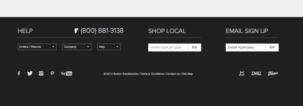
This is Burton Snowboards’ footer for its e-commerce site. It offers clearly sectioned information. We also see social engagement icons on this footer. Instead of having the site map listed out, they link to another page with a full sitemap. If we think of footers as helpers, this footer does a great job of providing helpful resources that a customer would want. There is a prominent phone number, as well as three dropdowns that upon hover show links to common resources such as: size chart, warranty, shipping, return information, customer service, etc. They’ve thought of a way to condense the information to maintain a mobile-friendly footer as well. The dropdowns are from a mobile-first approach, keeping the footer clean on mobile but the links will be available when needed. Because sitemaps can be long, when the browser gets smaller, it will take up too much room; in this case the dropdowns work perfectly.

2. Groupon
Groupon’s footer is full of information but still laid out in a clean, tidy way. The social integration trend in the footer still holds true here. There is a bigger site map than the other two examples but it still provides hierarchy and clearly labeled links to additional informational.
Something unique to the Groupon site is the two callouts for (1) download the Groupon app and (2) a link for businesses to get information if they are interested in posting a deal. This example uses the footer as a promotion area for the mobile app and their business platform.
Lastly, we also see a statement defining Groupon. Maybe this is for SEO purposes but a snippet about the business is not a bad idea. If your company is complicated, having one to two sentences about the company is useful to enhance brand awareness.

3. Growth Spark
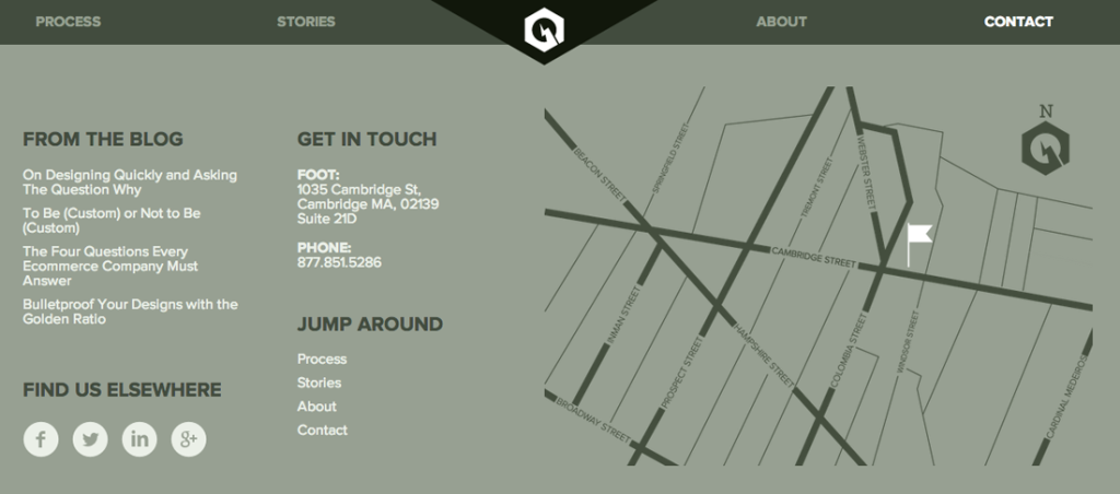
On this site (where I work), along with a handy fixed header, you will recognize some common footer conventions. This is an example of a business/agency footer. By pulling recent post headlines from our blog, we want the user to direct their attention to articles we’ve written. To make it easy for anyone who wants to find us, the address and phone number is included on the footer. And since we also have a social presence, the footer is a good place to link to them. Lastly, there is a small site map of our one-page site to navigate back to a section that intrigued them.

For more examples, here’s a gallery of creative and functional footer designs.
Seize the Footer
Footers haven’t been treated with the same enthusiasm and love as headers, but your footer is also on every page and should be just as impactful as the header. Footers can help enhance brand awareness, provide secondary information and drive users to better engagement. Footers are another chance to get users’ attention. Take the opportunity and start thinking about footers as the “next steps” and not a “goodbye.”
