
By Susan Robertson, from A List Apart – http://bit.ly/1qmIEJP
Several years ago, I was working on a large, complex application. It was a bit of a legacy project: many different designers and front-end developers had come and gone, each appending a new portion to the sprawling application. By the time I arrived, the CSS was huge, the styles were varied, and it took a lot of effort to find out if anything was reusable.
During all this, I discovered style guides—a way to control markup and CSS so neither veered out of control or ballooned. In jobs since, I’ve seen firsthand how style guides save development time, make communication regarding your front end smoother, and keep both code and design consistent throughout the site. It has been a revelation, and in this article, I want to show you how to build and maintain them, too.
What is a style guide?
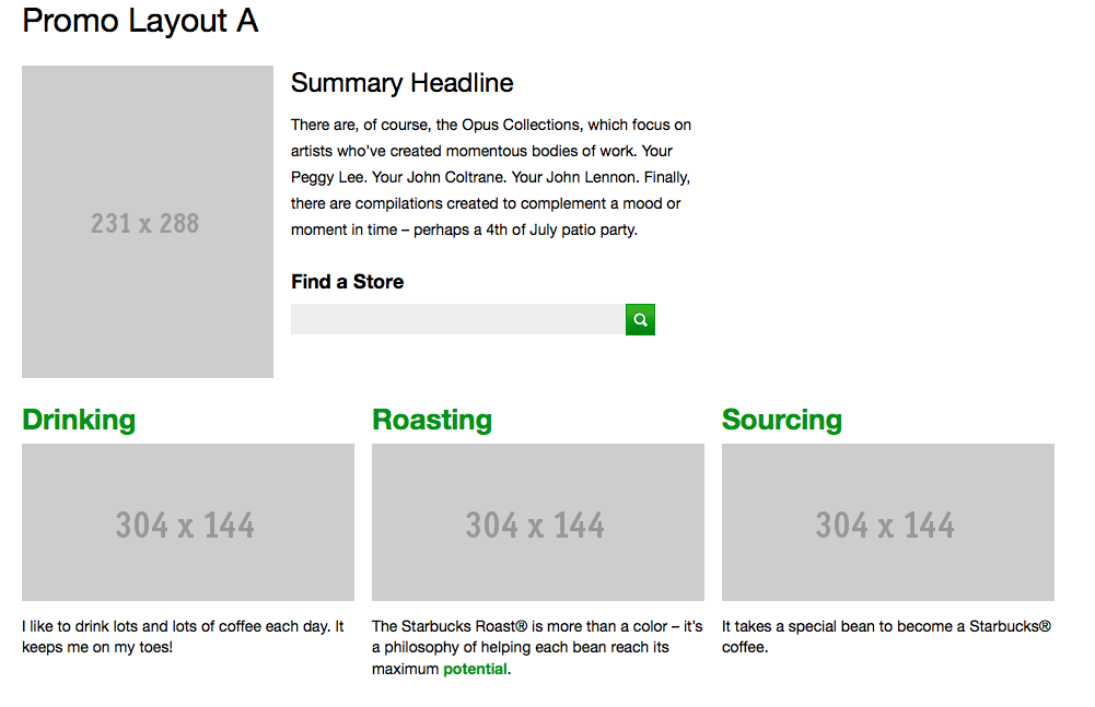
To me, a style guide is a living document of code, which details all the various elements and coded modules of your site or application. Beyond its use in consolidating the front-end code, it also documents the visual language, such as header styles and color palettes, used to create the site. This way, it’s a one-stop place for the entire team—from product owners and producers to designers and developers—to reference when discussing site changes and iterations. Several companies have even put their guides online; Starbucks is the most well known of the bunch, but others exist.
(I should also mention that what I call a style guide, some people call a pattern library. Many of the guides I reference use the term style guide, but pattern library is gaining in popularity.)
When I started working at Editorially, one of the first things I did was tackle the style guide. Creating the guide was probably the most useful thing I’ve ever done when settling into a new job: it forced me to go through every single line of CSS and read it, digest it, understand how it was used, and then document it for my own, and the team’s, future reference. In addition to catching inconsistencies and errors by poring through the CSS, if I didn’t understand how certain pieces of code were being used, I annotated the guide with questions (which my teammates graciously answered).
Why should I use a style guide?
As your team grows and changes over time, your style guide will help you in several ways. First, creating your guide will take some time up front, but I’ve found that this pays off with faster build times for new sections and pages, because anyone joining an ongoing project can refer to the guide for the exact styles to use.
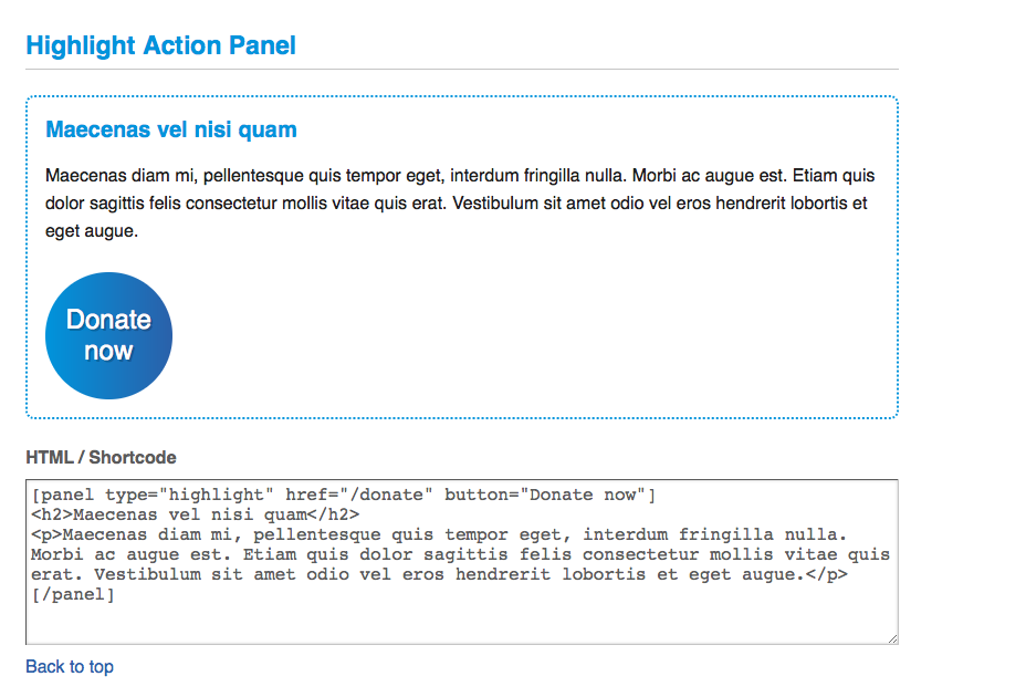
Second, a guide allows us to standardize the CSS, keeping it small and quick to load. By using the guide as an inventory of modules and code, both designers and developers can quickly see if new designs deviate from established standards, and decide as a team if it’s worth expanding the codebase or if something already written is easily extended. When you have no guide, this is impossible, which in my experience usually means that new styles are written—resulting in bloated CSS.
Third, design consistency is easier to maintain, as the designer can look in one place to reference the site’s components and ensure a cohesive look and feel throughout. This is especially helpful on larger teams and at enterprise-level companies where you may have an entire team of designers working on the site. And when design consistency is maintained, the codebase is also kept smaller.
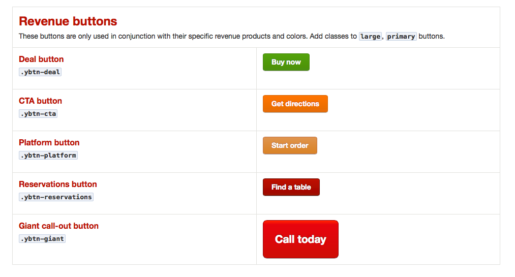
Fourth, communication becomes clearer as well. When I built out pages in a large-scale project and passed them off to the designer, she used the language of the various classes in the guide to ask for changes. This meant that we didn’t have any confusion on either of our parts as we sped through revisions. It also gave the entire team a shared vocabulary, like the names of modules, to use in talking about the designs once they were coded.
The final benefit I’ve found is that you can use your guide to do a quick QA pass. The guide may not be identical to the pages you eventually build out, but it can point out issues you may have in various browsers. By tackling these early on, you’ll avoid them in later testing.
Steps to build out your guide
Below, I’ll take you through starting your own guide, based on my first few weeks at Editorially. (Because when I work on a project without a guide, I’m soon jonesing to make one—just ask my colleagues).
Assemble your site’s basics
Start your guide with some of your site’s foundations. A foundational element may include the color palette, your grid layout system, or the basic type styles for headers and body text: whatever you feel are the very basic elements to create a page. For Editorially, the most foundational part of our site was the color guide, so I began with that and went from there. I created an HTML document with the markup, linking to the application CSS, so any CSS changes would be automatically reflected in the style guide.
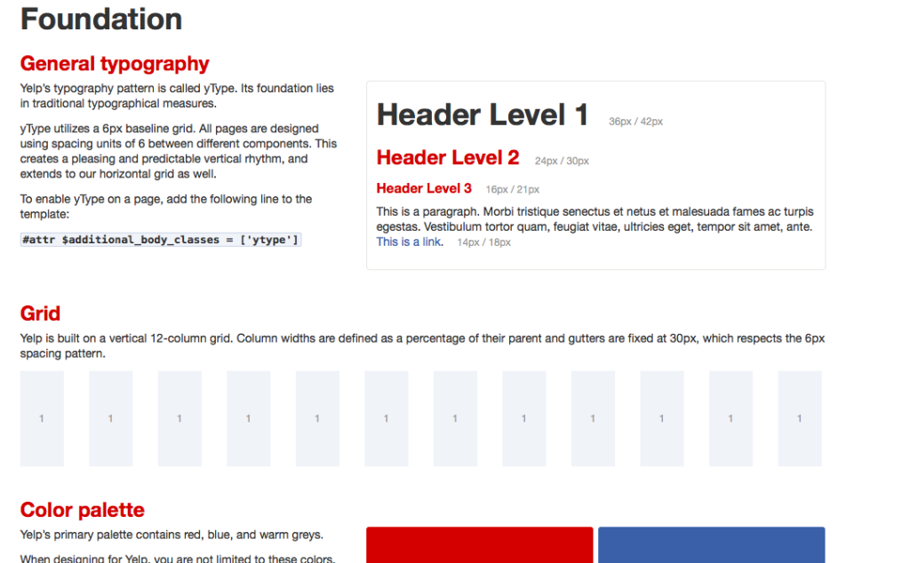
When you look at the style guide created by Yelp, you can see how it starts with the basics: typography, grid, and colors, adding more patterns as it goes along.
Add in more patterns
A pattern is any self-contained set of markup and styles to make some of your site’s basic objects, like a call-out box used repeatedly, buttons, or the way you lay out a list of links horizontally. At Editorially I documented all the variations possible of button and link styles. So go ahead and add the exact markup you need for each element to your guide.
For example, for a button in the Editorially guide, I simply put <label for="btn" class="btn" href="#">.btn <input type="submit" name="btn" value=".btn" /></label>. And because we link to the same CSS as the application does, the CSS shows correctly in the style guide. Should we change the .btn style, the style guide would change as well.
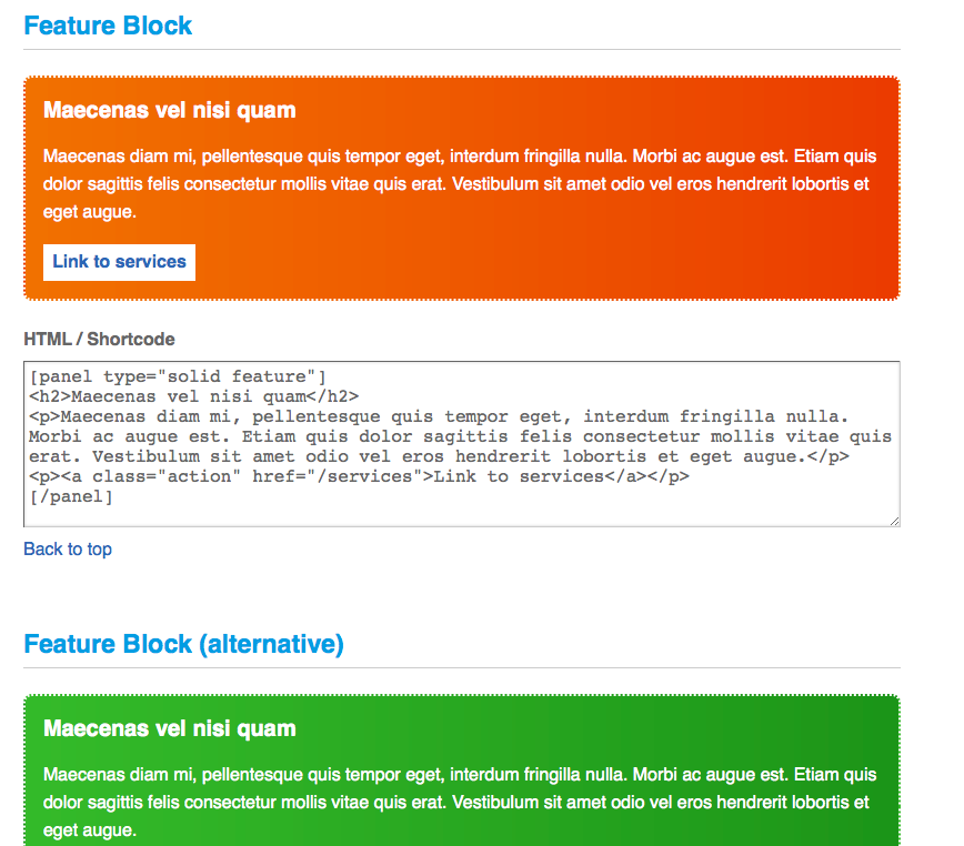
Keep going through your site and add in patterns as you see them; you may use particular layouts over and over, or a media-object pattern, or a vertical list pattern. Below is an another example from South Tees Hospital, showing some of their patterns for what they call feature blocks. Look for similar things on your own site to document in your guide.
This is also a good time to ask your team what else would be helpful to have in the style guide. Share it, let them take a look, and hopefully they’ll help you fill out all the patterns and modules needed. Don’t forget to have the entire team help you round it out, as it’s a resource for everyone.
Document interactivity
If possible, add the bits of interactivity that your site uses, such as dropdowns, modals, or tooltips, which are small hovers with helpful text that gives the user more information. This lets your team see not just the static versions of these things, but the animations as well. So when you’re looking at the guide and hover over or click on items, they’ll actually act as they would on your site.

Make maintenance easy
If you have to do extra work to update your style guide when making changes to your look and feel, the likelihood of it staying up to date is pretty slim. I’ve said it a few times now, but that’s why we linked the Editorially guide to the same CSS as the application—that way, we didn’t have to manually update the guide ourselves. It can be difficult to make updating the guide a priority, but maintenance is critical. Depending on how quickly you iterate on your site or application, you should check up on the guide as a regular task, whether it’s weekly or monthly. When you’re making changes to your site, update your style guide as part of the workflow.
Iterate your guide
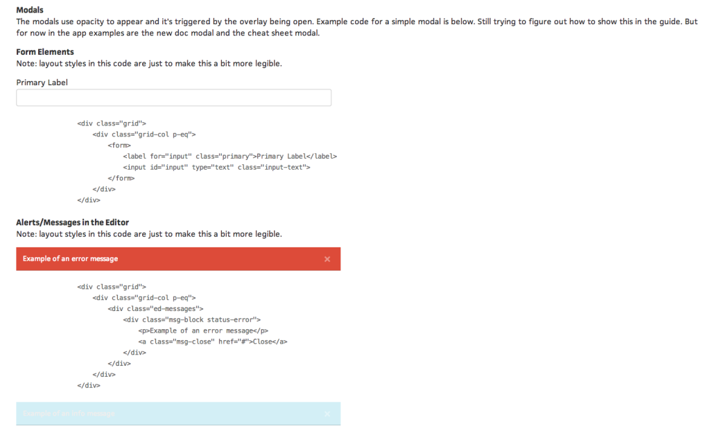
Once you have the bulk of your site’s or application’s components listed in your guide, you’ve got a wealth of tools to make it even more handy. As I built out the style guide for Editorially, a colleague pointed out the fantastic tool by Filament Group, X-rayHTML, which is a small JavaScript library to help you build out documentation. X-rayHTML takes the styled objects on your page and generates a nicely formatted code block below them, without any further code from you. You can also add prism.js for syntax highlighting, which color-codes the code for greater readability.
If you’re interested in automation, there are other tools that can make creating the guide even smoother. Two of these include KSS and Hologram. Both tools use things like commenting or YAML inside your stylesheets in combination with something like Ruby to automatically generate your style guide. It would take some work to go back and retrofit your stylesheets with the appropriate comments or YAML for these approaches, but you’d save time in the long run, as these tools make maintenance much, much easier. In addition, A List Apart has put their pattern library on GitHub and featured a blog post on its creation, demonstrating yet another method of building a style guide. The possibilities of what you can do are far greater than what I’ve outlined here; you might poke around to see what may be most helpful for you and your team.
Using the guide
Phew. You’ve done all this work and you’ve created this guide, so now what? How do you get people to use it? The first step is to talk about it. If a new team member comes on board, introduce her to the guide as a way of orienting her with the site, since the guide encompasses so much of both the visual and code languages of your front end.
As long as you’re iterating on a site or application, your style guide will never truly be finished. But having something documented early on, and showing it to teammates and getting their feedback, is a huge help. Involving the whole team in building the guide also makes it feel more like the team’s guide—and gets everyone invested in maintaining and using it on a regular basis.
So, are you convinced? Are you wishing you had a style guide for your site or application? It will be well worth the effort: make the time, get your team on board, start the build—and be rewarded with a document that speeds up the discussion and development of your site.
