from Responsive Strategy | Brad Frost Web: http://bit.ly/1gIiICH
Right now around 11 or 12% of the top 100,000 sites are responsive, and no doubt that number is slated to rise over the next few years.
As the people in the depraved cat-skinning business say, “there’s more than one way to skin a cat.” The sick bastards. As more organizations roll up their sleeves to tackle the realities of our multi-device Web, it’s worth taking a look at the various strategies employed to reach that squishy nirvana:
Responsive Retrofitting
 Responsive retrofitting is the process of taking an existing desktop-only website, and “making it responsive” after the fact.
For existing sites (particularly ones that are also businesses) teams don’t always have the luxury of tossing everything aside and building anew. Dan Cederholm
For many organizations, large-scale, from-the-ground-up redesigns are simply out of the question. That’s why responsive retrofitting is a popular approach to create a better user experience for non-desktop devices.
Pros
- Relatively quick – There’s really a whole spectrum of responsive retrofitting, but taken at its most basic definition, this strategy can literally consist of injecting a
small-screens.cssfile into your website. While that’s a crude example, responsive retrofitting is attractive for many organizations because it doesn’t require rebuilding everything from the ground up. - Familiar – Users don’t get knocked down the escalator of acquired knowledge. People get used to an interface over the years. By retrofitting an existing interface, organizations retain that level of familiarity while still providing a better user experience for smaller screens.
- Organizationally quicker – Politically speaking, retrofitting a lot safer than starting from scratch. There’s less bickering about what color green to use, what banal stock photos to use, and management doesn’t really need their arms twisted as hard. This allows teams to launch responsive sites sooner.
Cons
- Only scratches the surface – Again, there’s a whole spectrum of responsive retrofitting out there, but the goal for a great many of these projects is “make it squishy”. By focusing primarily or solely on reflowing layout, retrofitted responsive experiences often miss out on the whole world of other considerations that go into making a successful multi-device Web experience.
- 10 gallons of water in a 3 gallon bucket – Because desktop-only sites were made for desktops (and have often existed for a long while), they have a tendency to contain a lot of crap. And because most retrofitting exercises focus on reflowing layout, a lot of these content-related issues aren’t fully addressed.
- Performance – There’s something weird about writing more code to better support smaller devices. Subtraction can go a long way, but retrofitting doesn’t inherently encourage performance as design.
- Worse support – mobile-first media queries provide better support for the many Web-enabled mobile devices that don’t support media queries.
- Band-Aid fix – I die a little whenever I hear people say “make it responsive” like it’s some checkbox on a project plan (which sometimes is actually the case). This type of myopic thinking misses the true opportunity responsive design provides.
Responsive Mobile Sites
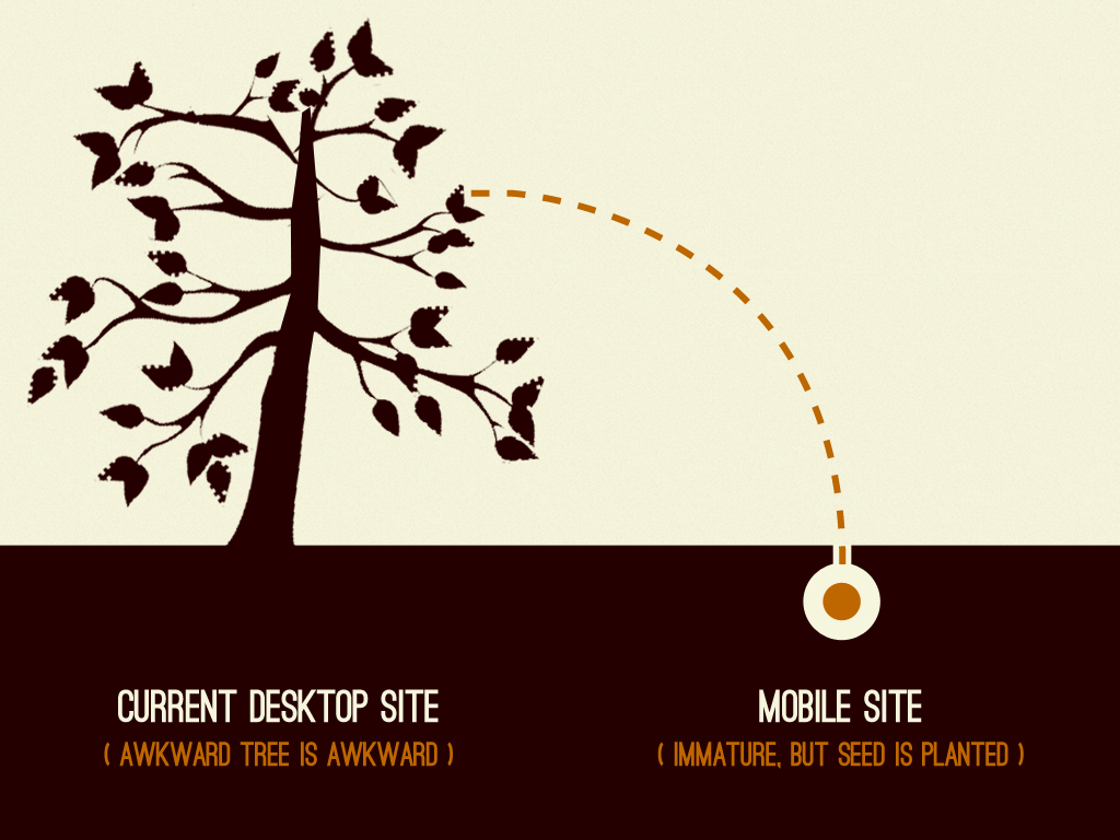
Responsive mobile sites, or what I call planting the seed to a responsive future, is the practice of making a separate m-dot site that employs responsive design techniques. Organizations like The BBC, The Guardian, and (a site I worked on) Entertainment Weekly are all utilizing this strategy.

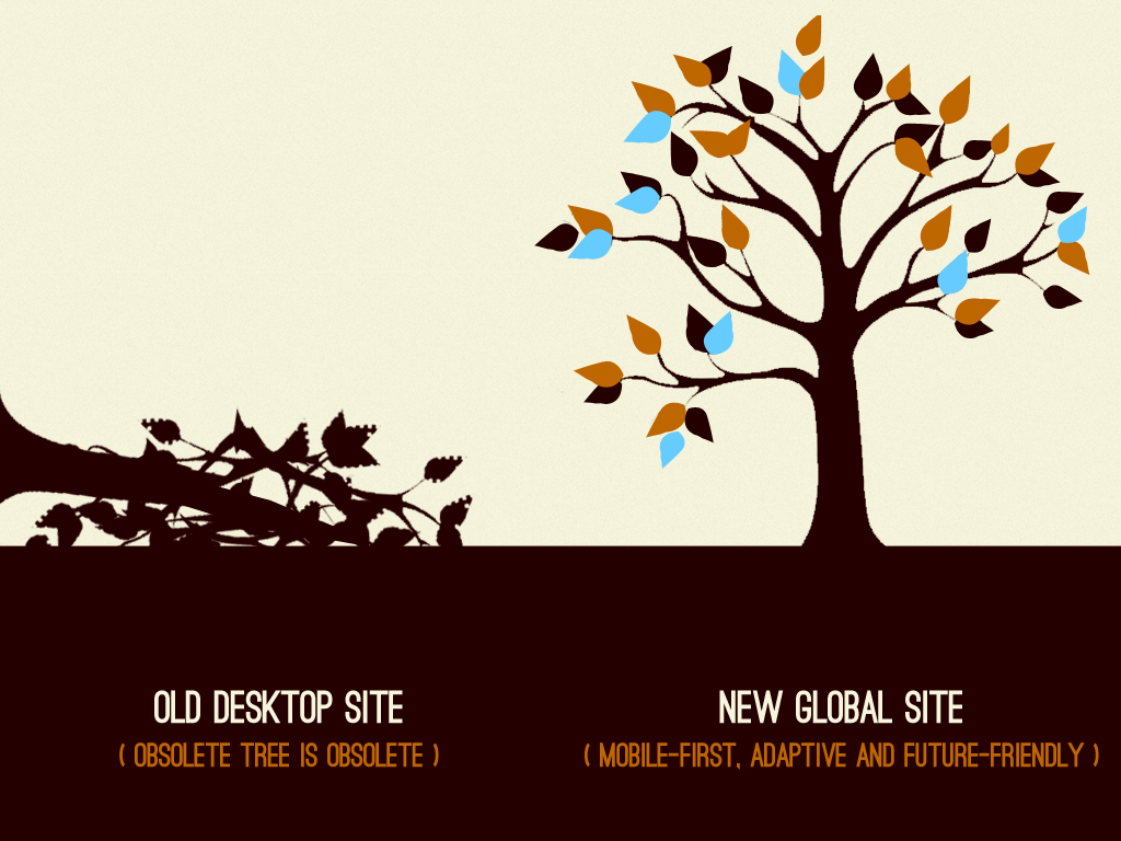
Mobile provides an opportunity to plant the seed to grow out of your legacy desktop site.

With time and effort, the legacy site can be removed and a mobile-first, adaptive, future friendly experience
Pros
- Lower risk – Most organizations still see a minority of Web traffic coming from mobile devices. So launching a responsive mobile site allows organizations to test the responsive waters without betting the farm on responsive design.
- Learning to be flexible – Designers can learn how to think more fluidly. Developers learn about the myriad quirks of old Android devices. Management can learn to let go of pixel-perfection. A responsive m-dot can serve as an important sandbox for learning.
- Infrastructure – Teams can learn to tackle tough content management issues, like art directing images and more.
- Trim the fat – This approach offers a better chance for teams to ask “do we really need that”, as well as focus on performance. Why? Because they’re focused on making a mobile experience first and foremost.
- A mobile-first future – While initially deficient in content or features, given enough time and effort these mobile sites can ultimately replace their former desktop counterparts.
Cons
- It’s still an m-dot site. – Responsive or not, this approach still inherits the many woes of m-dot sites: URL redirect issues, content management/governance issues, content parity issues, continuity, SEO, and more.
- Band-Aid fix – A lot of mobile sites are created to stop the bleeding. Many m-dot sites are created to address the growing amount of traffic coming from mobile devices. While these solutions can certainly solve present needs, this doesn’t necessarily translate into a long-term, future-friendly strategy.
- Die on the vine – Some organizations will start these projects, get halfway through the transformation, then throw it all away once next year’s budget gets approved.
- Small screens design – Because of the initial focus on small screens, it can be challenging to scale up an interface to look great on larger screens after the fact.
Mobile-first Responsive Design

Mobile-first responsive design creating an interface that addresses the constraints of mobile (small screen, low bandwidth, etc), then progressively enhances the experience to take advantage of available screen space, features, and more.
Pros
- A fresh start – A mobile-first responsive project is a clean start. Designers are excited to focus on core user and business goals. Developers are focused on lean, mean markup. By casting aside (or totally reworking) an existing codebase, teams can address our multi-device reality without having to worry about legacy overhead.
- Better support – By developing mobile-first, developers are able to support more mobile devices, especially older devices that don’t support media queries.
- Performance – While the performance of any site really depends on the implementation, a mobile-first responsive project gives teams the opportunity to address performance out of the gate.
- Concurrent Consideration – More broadly speaking, a mobile-first redesign (despite its name) tends to factor in the entire resolution spectrum rather than placing emphasis on any one device class.
- Future friendly – A mobile-first experience addresses creates more an opportunity to create a sound foundation that’s build to stand the test of time, and to serve as a platform for future growth and iteration.
Cons
- Time consuming – let’s face it, a mobile-first redesign isn’t a shortcut. It takes a lot of time and effort to build things from the ground up. The trick is to make the effort worth it.
- A mental shift – It’s challenging to get teams and organizations to think about things differently. The mobile-first mentality flips everything on its head, which challenges the conventions people have gotten used to over the years. This requires selling things through (thankfully there’s a book for that), and ongoing reminders to keep people from falling back into their old ways.
- Organizationally difficult – A big redesign is usually encumbered with all sorts of organizational red tape. The CEO wants to weigh in on the designs, despite not being in all the preliminary meetings on what all this responsive design hoobityboop is all about. Ambition and politics can get in the way of creating a user experience that looks and functions great on any device.
- Unfamiliar – Any redesign is going to be unfamiliar to users at first. But great care needs to be taken to maintain users’ level of familiarity with the interface, especially after going through a major overhaul.
Piecemeal
A piecemeal responsive strategy breaks a large-scale redesign down into bite sized chunks. Like retrofitting (although in this case these strategies aren’t mutually exclusive), it might not be possible to undergo a massive redesign. That’s why some organizations take it a step at a time. There are few different flavors of piecemeal responsive redesigns:
Page by Page
Page-by-page responsive redesigns take a subset of pages . Companies like Microsoft have rolled out responsive homepages, while leaving the majority of interior pages desktop-only.
Pros
- Highly visible – rolling out a responsive version of most viewed pages (like a homepage) puts the effort where most users are likely to see the refreshed redesign.
- Learning to be flexible – Organizations often use these projects as pilots for broader initiatives. By focusing on a few core pages, they’re able to learn all that goes into making a responsive interface and then use that knowledge to apply to the rest of the site.
- Better chance of launching – Focusing on one page or one feature is a great way to make sure things actually get done. Redesigning the whole kit and caboodle at once could be a monstrous undertaking, which means it might never see the light of day.
Cons
- Continuity – User goes from shiny, new responsive experience to crappy legacy content a few quick clicks. This is bad from a consistency standpoint, as users view a company as a single brand, not as a hodgepodge of different departments and priorities.
- Short-sighted – a lot of page-based redesigns are so focused on “launching by Q3″, there often isn’t a game plan for rolling out the project to the larger site.
- Die on the vine – You have to plant a flag in the sand first and foremost with a strategy like this, or else risk permanently living in Frankenstein land.
Component by Component
I’ve worked with several organizations that are undertaking a rather interesting approach to responsive design. Instead of tackling the homepage first then moving onto interior pages, some organizations are making key components (like the header and footer) responsive, then slowly moving onto other components. When the whole interface is made responsive, they switch on the viewport meta tag and be left with a responsive experience.
Pros
- Gradually introduce users to a new interface– Instead of knocking users over their heads with an All-New, 100% Amazing Responsive Experience(!), this piecemeal approach introduces the new interface over a period of time. The changes aren’t so extreme that users will be angry, but move the design in the right direction.
- Break things down – Teams learn to solve problems at the modular, atomic level rather than focusing on the page.
- Gauge level of effort – Breaking things down into modules gives a better idea of the scope of the project.
Cons
- 50 Shades of Incomplete – This approach can be awkward as users are exposed to a Frankensteined interface that is both old and new, fresh and stale.
- Die on the vine – these types of projects need to have clear end goals or they could end up in purgatory forever.
- Technical co-existence – What happens when one module using the latest technology and techniques butts heads with an old crusty legacy module? There are lots of technical architecture challenges with this approach.
“I’m Chevy Chase…and you’re not.”
Of course, every organization is different, so which path to choose depends on a number of factors. Time, budget, scope, organizational structure, skillset, and more all influence which responsive strategy to employ. But as time goes on, it’s becoming increasingly apparent that organizations need to address the ever-growing multitude of devices that access the Web.
